
 When assumptions are broken we stop being able to draw accurate conclusions about reality. Different statistical models assume different things, and if these models are going to reflect reality accurately then these assumptions need to be true. Parametric models are statistical techniques (i.e. regression, means testing, factorial designs) designed for use when data have certain distributional characteristics.1 For data to be parametric certain assumptions must be fulfilled; if you use a parametric test when your data are not parametric then the results are likely to be inaccurate. Therefore, it is very important that you check the assumptions before deciding which statistical test is appropriate; and one of the first parametric assumptions most people think of is the assumption of normality.
The assumption of normality is important for hypothesis testing and in regression models. In general linear models, the assumption comes in to play with regards to residuals (aka errors). In both cases it is useful to test for normality; therefore, this tutorial covers the following:
The assumption of normality claims that the sampling distribution of the mean is normal or that the distribution of means across samples is normal. This should not be confused with the presumption that the values within a given sample are normally distributed or that the values within the population from which the sample was taken are normal. Rather, the core element of this assumption is that the distribution of sample means (across independent samples) is normally distributed. Luckily, we know from the Central Limit Theorem (CLT) that if the sample data are approximately normal then the sampling distribution will be as well. We also know from the CLT that in big samples the sampling distribution tends to be normal anyway.
Central Limit Theorem: given random and independent samples of N observations each, the distribution of sample means approaches normality as the size of N increases, regardless of the shape of the population distribution.
To illustrate ways to assess normality, I’ll demonstrate with some golf data provided by ESPN. In addition, the packages we will leverage include the following:
library(readxl)         # read in Excel data
library(ggplot2)        # create visualizations
library(psych)          # provide summary statistics
library(pastecs)        # provide summary statistics
☛ See Working with packages for more information on installing, loading, and getting help with packages.
First, let’s read in the data. The data frame consists of 18 variables, which I illustrate the first 10 below:
library(readxl)

golf <- read_excel("Golf Stats.xlsx", sheet = "2011")

head(golf[, 1:10])
##   Rank         Player Age Events Rounds Cuts Made Top 10s Wins Earnings Yards/Drive
## 1    1    Luke Donald  34     19     67        17      14    2  6683214       284.1
## 2    2   Webb Simpson  26     26     98        23      12    2  6347354       296.2
## 3    3    Nick Watney  30     22     77        19      10    2  5290674       301.9
## 4    4      K.J. Choi  41     22     75        18       8    1  4434690       285.6
## 5    5 Dustin Johnson  27     21     71        17       6    1  4309962       314.2
## 6    6    Matt Kuchar  33     24     88        22       9    0  4233920       286.2
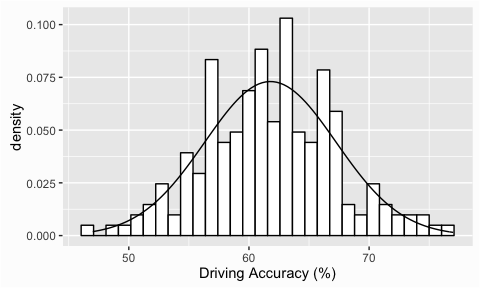
Frequency distributions are a useful way to look at the shape of a distribution and are, typically, our first step in assessing normality. Not only can we assess the distribution of the data we are analyzing, we can also add a reference normal distribution onto our plot to compare. We can illustrate with some golf data provided by ESPN. Here we are assessing the distribution of Driving Accuracy across 200 players and when we add the reference normal distribution with the stat_function() argument we see that the data does in fact appear to be normally distributed.
library(readxl)
library(ggplot2)

golf <- read_excel("Data/Assumptions/Golf Stats.xlsx", sheet = "2011")

ggplot(golf, aes(`Driving Accuracy`)) +
        geom_histogram(aes(y = ..density..), colour = "black", fill = "white") +
        stat_function(fun = dnorm, args = list(mean = mean(golf$`Driving Accuracy`, na.rm = T),
                                               sd = sd(golf$`Driving Accuracy`, na.rm = T))) +
        xlab("Driving Accuracy (%)")
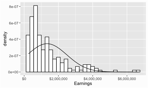
If we compare this to the Earnings variable we’ll see a larger discrepency between the actual distribution and the reference normal distribution had earnings followed a normal distribution. This does not necessarily answer the question of whether the values are normally distributed but it helps provide indication of one way or the other.
ggplot(golf, aes(Earnings)) +
        geom_histogram(aes(y = ..density..), colour = "black", fill = "white") +
        stat_function(fun = dnorm, args = list(mean = mean(golf$Earnings, na.rm = T),
                                               sd = sd(golf$Earnings, na.rm = T))) +
        scale_x_continuous(label = scales::dollar)
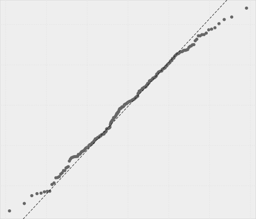
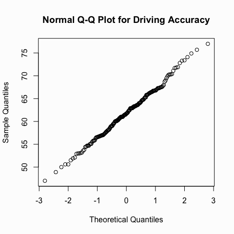
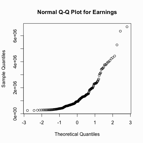
Another useful graph that we can inspect to see if a distribution is normal is the Q-Q plot. This graph plots the cumulative values we have in our data against the cumulative probability of a particular distribution (in this case we specify a normal distribution). In essence, this plot compares the actual value against the expected value that the score should ave in a normal distribution. If the data are normally distributed the plot will display a straight (or nearly straight) line. If the data deviates from normality then the line will display strong curvature or “snaking.”
We can illustrate with the same two variables we looked at above. You can see how the Q-Q plot for the driving accuracy displays a nice straight line whereas the Q-Q plot for earnings is heavily skewed.
qqnorm(golf$`Driving Accuracy`, main = "Normal Q-Q Plot for Driving Accuracy")
qqnorm(golf$Earnings, main = "Normal Q-Q Plot for Earnings")
Visualization helps provide indications, however, their interpretations are subjective and cannot be solely relied on. Therefore, its important to support the visual findings with objective quantifications that describe the shape of the distribution and to look for outliers. We can do this by using the describe() function from the psych package or the stat.desc() function from the pastecs package.
The describe() function provides several summary statistics. The two we are primarily concerned about for normality are the skew and kurtosis results. Skew describes the symmetry of a distribution and kurtosis the peakedness. Values close to zero, as seen in driving accuracy, suggest an approximately normal distribution. Values that deviate from zero on one or both of these statistics, as is the case with Earnings, suggest a possible deviation from normality. The actual cutoff values for these statistics are debatable; however, keep in mind these statistics, like the visualizations, are still giving you indications of normality.
library(psych)

# assess one variable
describe(golf$`Driving Accuracy`)
##   vars   n  mean   sd median trimmed  mad min max range skew kurtosis   se
## 1    1 197 61.79 5.46   61.7   61.71 5.78  47  77    30 0.09    -0.04 0.39

# assess multiple variables
describe(golf[, c("Driving Accuracy", "Earnings")])
##                  vars   n       mean         sd   median    trimmed
## Driving Accuracy    1 197      61.79       5.46     61.7      61.71
## Earnings            2 200 1336649.41 1155157.90 941255.0 1120407.53
##                        mad    min     max   range skew kurtosis       se
## Driving Accuracy      5.78     47      77      30 0.09    -0.04     0.39
## Earnings         761431.93 250333 6683214 6432882 1.85     3.88 81682.00
We can also use stat.desc() to get similar results. To reduce the amount of statistics we get back we can set the argument basic = FALSE and to get statistics back relating to the distribution we set the argument norm = TRUE. The first two parameters of interest are the skew.2se and kurt.2se results, which are the skew and kurtosis value divided by 2 standard errors. If the absolute value of these parameters are > 1 then they are significant (at p < .05) suggesting strong potential for non-normality.
The output of stat.desc() also gives us the Shapiro-Wilk test of normality, which provides a more formal statistic test for normality deviations, which we will discuss next.
library(pastecs)

# assess one variable
stat.desc(golf$`Driving Accuracy`, basic = FALSE, norm = TRUE)
##       median         mean      SE.mean CI.mean.0.95          var
##  61.70000000  61.78578680   0.38927466   0.76770460  29.85234797
##      std.dev     coef.var     skewness     skew.2SE     kurtosis
##   5.46373023   0.08843021   0.09349445   0.26988823  -0.03637605
##     kurt.2SE   normtest.W   normtest.p
##  -0.05275937   0.99626396   0.91530114

# assess multiple variables
stat.desc(golf[, c("Driving Accuracy", "Earnings")], basic = FALSE, norm = TRUE)
##              Driving Accuracy     Earnings
## median            61.70000000 9.412550e+05
## mean              61.78578680 1.336649e+06
## SE.mean            0.38927466 8.168200e+04
## CI.mean.0.95       0.76770460 1.610734e+05
## var               29.85234797 1.334390e+12
## std.dev            5.46373023 1.155158e+06
## coef.var           0.08843021 8.642191e-01
## skewness           0.09349445 1.846104e+00
## skew.2SE           0.26988823 5.368929e+00
## kurtosis          -0.03637605 3.876503e+00
## kurt.2SE          -0.05275937 5.664051e+00
## normtest.W         0.99626396 8.004944e-01
## normtest.p         0.91530114 2.918239e-15
The Shapiro-Wilk test is a statistical test of the hypothesis that the distribution of the data as a whole deviates from a comparable normal distribution. If the test is non-significant (p>.05) it tells us that the distribution of the sample is not significantly different from a normal distribution. If, however, the test is significant (p < .05) then the distribution in question is significantly different from a normal distribution.
The results below indicate that the driving accuracy data does not deviate from a normal distribution, however, the earnings data is statistically significant suggesting it does. Also, note that the value for W below corresponds to the normtest.W from the stat.desc() outputs above and the p-value below corresponds to the normtest.p from stat.desc().
shapiro.test(golf$`Driving Accuracy`)
##
## 	Shapiro-Wilk normality test
##
## data:  golf$`Driving Accuracy`
## W = 0.99626, p-value = 0.9153

shapiro.test(golf$Earnings)
##
## 	Shapiro-Wilk normality test
##
## data:  golf$Earnings
## W = 0.80049, p-value = 2.918e-15
Its important to note that there are limitations to the Shapiro-Wilk test. As the dataset being evaluated gets larger, the Shapiro-Wilk test becomes more sensitive to small deviations which leads to a greater probability of rejecting the null hypothesis (null hypothesis being the values come from a normal distribution).
The principal message is that to assess for normality we should not rely on only one approach to assess our data. Rather, we should understand the distribution visually, through descriptive statistics, and formal testing procedures to come to our conclusion of whether our data meets the normality assumption or not.
Most commonly when data approximate a normal distribution and are measurable with interval or ratio scales. ↩