
Correlation is a bivariate analysis that measures the extent that two variables are related (“co-related”) to one another. The value of the correlation coefficient varies between +1 and -1. When the value of the correlation coefficient lies around ±1, then it is said to be a perfect degree of association between the two variables (near +1 implies a strong positive association and near -1 implies a strong negative association). As the correlation coefficient nears 0, the relationship between the two variables weakens with a near 0 value implying no association between the two variables. This tutorial covers the different ways to visualize and assess correlation.
This tutorial serves as an introduction to assessing correlation between variables. First, I provide the data and packages required to replicate the analysis and then I walk through the ways to visualize associations followed by demonstrating four different approaches to assess correlations.
This tutorial leverages the following packages:
library(readxl)         # reading in data
library(ggplot2)        # visualizing data
library(gridExtra)      # combining multiple plots
library(corrgram)       # visualizing data
library(corrplot)       # visualizing data
library(Hmisc)          # produces correlation matrices with p-values
library(ppcor)          # assesses partial correlations
To illustrate ways to visualize correlation and compute the statistics, I will demonstrate with some golf data provided by ESPN and also with some artifical survey data. The golf data has 18 variables, which you can see the first 9 below; and the survey data has 11.
library(readxl)

golf <- read_excel("Golf Stats.xlsx", sheet = "2011")

head(golf[, 1:9])
##   Rank         Player Age Events Rounds Cuts Made Top 10s Wins Earnings
## 1    1    Luke Donald  34     19     67        17      14    2  6683214
## 2    2   Webb Simpson  26     26     98        23      12    2  6347354
## 3    3    Nick Watney  30     22     77        19      10    2  5290674
## 4    4      K.J. Choi  41     22     75        18       8    1  4434690
## 5    5 Dustin Johnson  27     21     71        17       6    1  4309962
## 6    6    Matt Kuchar  33     24     88        22       9    0  4233920

survey <- read_excel("Survey_Results.xlsx", sheet = "Sheet1", skip = 2)

head(survey)
##   Observation Q1 Q2 Q3 Q4 Q5 Q6 Q7 Q8 Q9 Q10
## 1           1  1 -1  1  0  1  1  1  0  0   0
## 2           2  1 -1  2 -2  1  1  0  0  0   1
## 3           3  0  0  3 -1 -1  0 -1  0  1   0
## 4           4  0  0  3  0  1  1 -1  0  1   1
## 5           5  0 -1  2 -1 -1 -1 -1 -1 -1  -1
## 6           6  2  1  2 -1  1  0  1  0  1   1
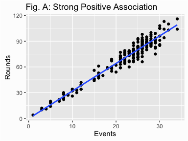
A correlation is a single-number measure of the relationship between two variables. Although a very useful measure, it can be hard to image exactly what the association is between two variables based on this single statistic. In contrast, a scatterplot of two variables provides a vivid illustration of the relationship between two variables. In short, a scatterplot can convey much more information than a single correlation coefficient. For instance, the following scatter plot illustrates just how strongly rounds played and events played are associated in a positive fashion.
qplot(x = Events, y = Rounds, data = golf) +
        geom_smooth(method = "lm", se = FALSE) +
        ggtitle("Fig. A: Strong Positive Association")
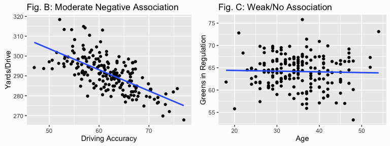
Contrast this to the following two plots which shows as driving accuracy increases the distance of the player’s drive tends to decrease (Fig. B) but this association is far weaker than we saw above due to greater variance around the trend line. In addition we can easily see that as a player’s age increases their greens in regulation percentage does not appear to change (Fig. C).
library(gridExtra)

p1 <- qplot(x = `Driving Accuracy`, y = `Yards/Drive`, data = golf) +
        geom_smooth(method = "lm", se = FALSE) +
        ggtitle("Fig. B: Moderate Negative Association")

p2 <- qplot(x = Age, y = `Greens in Regulation`, data = golf) +
        geom_smooth(method = "lm", se = FALSE) +
        ggtitle("Fig. C: Weak/No Association")

grid.arrange(p1, p2, ncol = 2)
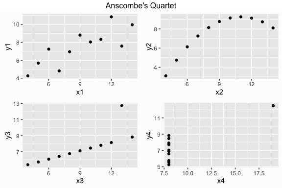
In addition, scatter plots illustrate the linearity of the relationship, which can influence how you approach assessing correlations (i.e. data transformation, using a parametric vs non-parametric test, removing outliers). Francis Anscombe illustrated this in 19731 when he constructed four data sets that have the same mean, variance, and correlation; however, there are significant differences in the variable relationships. Using the anscombe data, which R has as a built in data set, the plots below demonstrate the importance of graphing data rather than just relying on correlation coefficients. Each x-y combination in the plot below has a correlation of .82 (strong positive) but there are definitely differences in the association between these variables.
library(gridExtra)
library(grid)

p1 <- qplot(x = x1, y = y1, data = anscombe)
p2 <- qplot(x = x2, y = y2, data = anscombe)
p3 <- qplot(x = x3, y = y3, data = anscombe)
p4 <- qplot(x = x4, y = y4, data = anscombe)

grid.arrange(p1, p2, p3, p4, ncol = 2,
             top = textGrob("Anscombe's Quartet"))
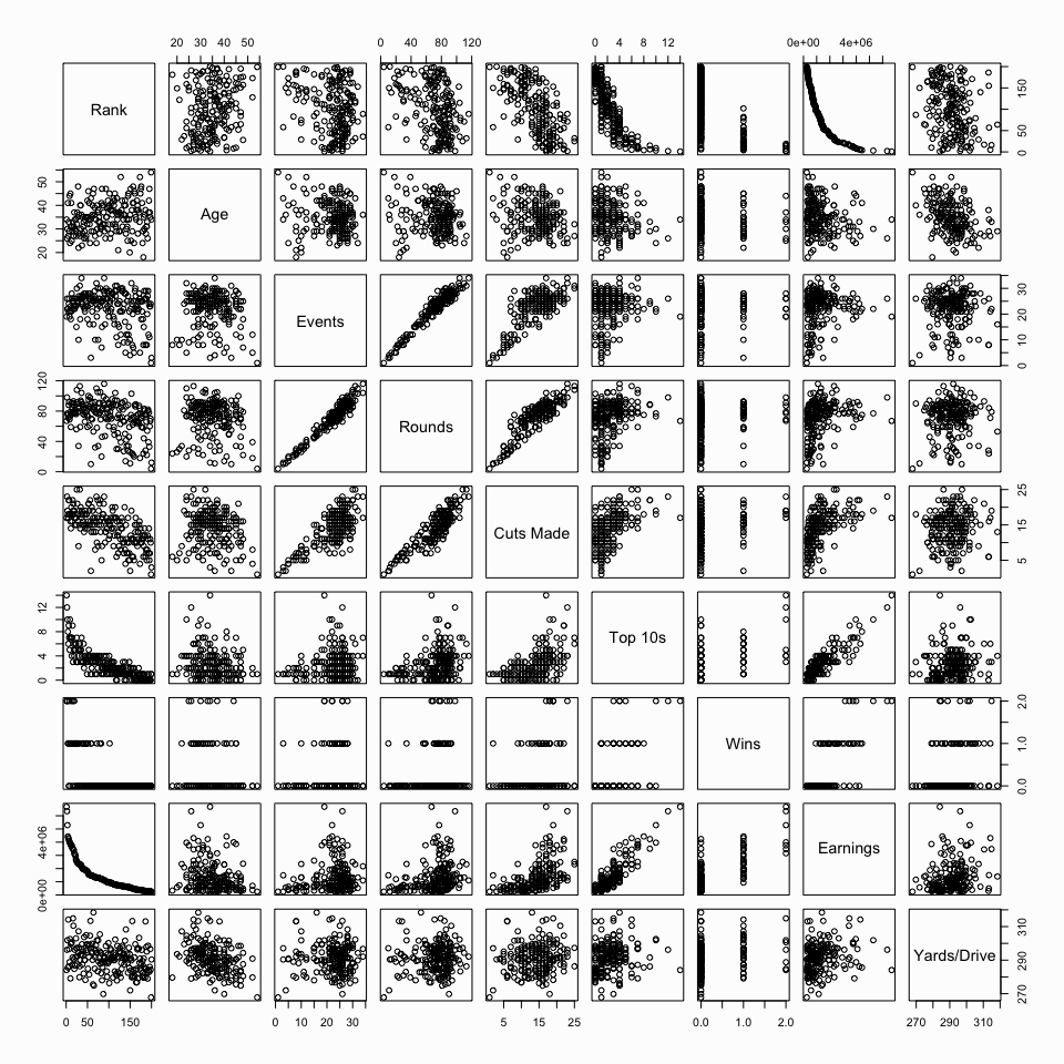
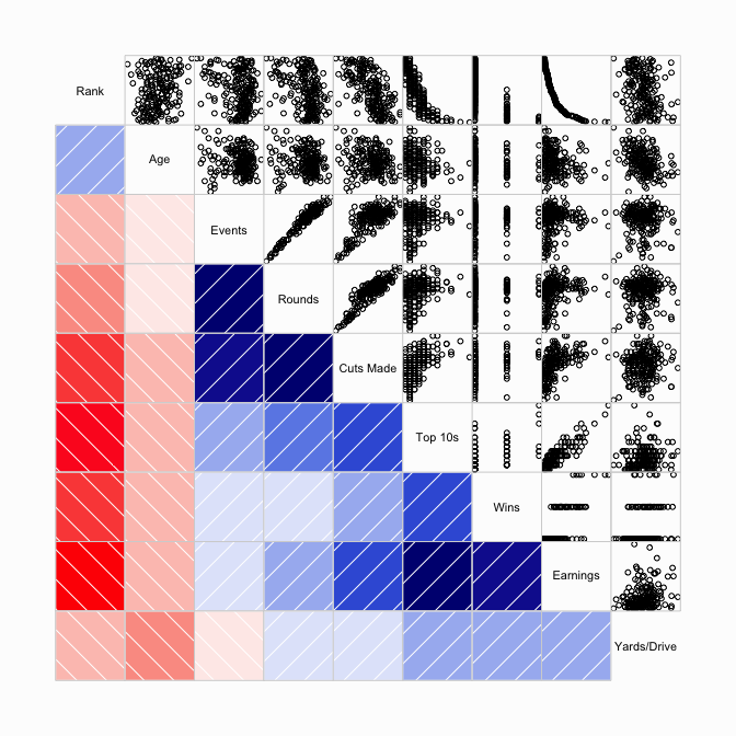
Visualization can also give you a quick approach to assessing multiple relationships. We can produce scatter plot matrices multiple ways to visualize and compare relationships across the entire data set we are analyzing. With base R plotting we can use the pairs() function. Lets look at the first 10 variables of the golf data set (minus the player name variable). You can instantly see those variables that are strongly associated (i.e. Events, Rounds, Cuts Made), not associated (i.e. Rank, Age, Events), nonlinearly associated (i.e. Rank, Top 10s), or categorical in nature (Wins).
pairs(golf[, c(1, 3:10)])
There are multiple ways to produce scatter plot matrices such as these. Additional means includes the corrgram and corrplot packages. Note that multiple options exist with both these visualizations (i.e. formatting, correlation method applied, illustrating significance and confidence intervals, etc.) so they are worth exploring.
library(corrgram)

par(bg = "#fdfdfd")
corrgram(golf[, c(1, 3:10)], lower.panel = panel.shade, upper.panel = panel.pts)
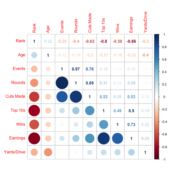
For corrplot you must first compute the correlation matrix and then feed that information into the graphic function.
library(corrplot)

cor_matrix <- cor(golf[, c(1, 3:10)], use = 'complete.obs')
corrplot.mixed(cor_matrix, lower = "circle", upper = "number", tl.pos = "lt", diag = "u")
Once you’ve visualized the data and understand the associations that appear to be present and their attributes (strength, outliers, linearity) you can begin assessing the statistical relationship by applying the appropriate correlation method.
The Pearson correlation is so widely used that when most people refer to correlation they are referring to the Pearson approach. The Pearson product-moment correlation coefficient measures the strength of the linear relationship between two variables and is represented by r when referring to a sample or ρ when referring to the population. Considering we most often deal with samples I’ll use r unless otherwise noted.
Unfortunately, the assumptions for Pearson’s correlation are often overlooked. These assumptions include:
R provides multiple functions to analyze correlations. To calculate the correlation between two variables we use cor(). When using cor() there are two arguments (other than the variables) that need to be considered. The first is use = which allows us to decide how to handle missing data. The default is use = everything but if there is missing data in your data set this will cause the output to be NA unless we explicitly state to only use complete observations with use = complete.obs. The second argument is method = which allows us to specify if we want to use “pearson”, “kendall”, or “spearman”. Pearson is the default method so we do not need to specify for that option.
# If we don't filter out NAs we get NA in return
cor(golf$Age, golf$`Yards/Drive`)
## [1] NA

# Filter NAs to get correlation for complete observations
cor(golf$Age, golf$`Yards/Drive`, use = 'complete.obs')
## [1] -0.3960891

# We can also get the correlation matrix for multiple variables but we need
# to exclude any non-numeric values
cor(golf[, c(1, 3:10)], use = 'complete.obs')
##                   Rank        Age      Events      Rounds  Cuts Made
## Rank         1.0000000  0.2178987 -0.25336860 -0.39896409 -0.6340634
## Age          0.2178987  1.0000000 -0.11910802 -0.14056653 -0.1950816
## Events      -0.2533686 -0.1191080  1.00000000  0.96635795  0.7614576
## Rounds      -0.3989641 -0.1405665  0.96635795  1.00000000  0.8913155
## Cuts Made   -0.6340634 -0.1950816  0.76145761  0.89131554  1.0000000
## Top 10s     -0.8033446 -0.2052073  0.17710952  0.30790212  0.5255005
## Wins        -0.5765412 -0.1753386  0.04591368  0.12215216  0.2460359
## Earnings    -0.8585013 -0.2175656  0.15208235  0.29048622  0.5289126
## Yards/Drive -0.3008188 -0.3960891 -0.02052854  0.03470326  0.1465976
##                Top 10s        Wins   Earnings Yards/Drive
## Rank        -0.8033446 -0.57654121 -0.8585013 -0.30081875
## Age         -0.2052073 -0.17533858 -0.2175656 -0.39608914
## Events       0.1771095  0.04591368  0.1520823 -0.02052854
## Rounds       0.3079021  0.12215216  0.2904862  0.03470326
## Cuts Made    0.5255005  0.24603589  0.5289126  0.14659757
## Top 10s      1.0000000  0.49398282  0.8957970  0.19397586
## Wins         0.4939828  1.00000000  0.7313615  0.21563889
## Earnings     0.8957970  0.73136149  1.0000000  0.25041021
## Yards/Drive  0.1939759  0.21563889  0.2504102  1.00000000
Unfortunately cor() only provides the r coefficient(s) and does not test for significance nor provide confidence intervals. To get these parameters for a simple two variable analysis I use cor.test(). In our example we see that the p-value is significant and the 95% confidence interval confirms this as the range does not contain zero. This suggests the correlation between age and yards per drive is r = -0.396 with 95% confidence of being between -0.27 and -0.51.
cor.test(golf$Age, golf$`Yards/Drive`, use = 'complete.obs')
##
## 	Pearson's product-moment correlation
##
## data:  golf$Age and golf$`Yards/Drive`
## t = -5.8355, df = 183, p-value = 2.394e-08
## alternative hypothesis: true correlation is not equal to 0
## 95 percent confidence interval:
##  -0.5111490 -0.2670825
## sample estimates:
##        cor
## -0.3960891
We can also get the correlation matrix and the p-values across all variables by using the rcorr() function in the Hmisc package. This function will provide the correlation matrix, number of pairwise observations used, and the p-values. Note that rcorr() does not provide confidence intervals like cor.test().
library(Hmisc)
rcorr(as.matrix(golf[, c(1, 3:9)]))
##            Rank   Age Events Rounds Cuts Made Top 10s  Wins Earnings
## Rank       1.00  0.21  -0.23  -0.38     -0.63   -0.80 -0.58    -0.86
## Age        0.21  1.00  -0.09  -0.12     -0.17   -0.20 -0.17    -0.21
## Events    -0.23 -0.09   1.00   0.97      0.75    0.16  0.04     0.14
## Rounds    -0.38 -0.12   0.97   1.00      0.88    0.29  0.12     0.28
## Cuts Made -0.63 -0.17   0.75   0.88      1.00    0.52  0.25     0.53
## Top 10s   -0.80 -0.20   0.16   0.29      0.52    1.00  0.50     0.89
## Wins      -0.58 -0.17   0.04   0.12      0.25    0.50  1.00     0.73
## Earnings  -0.86 -0.21   0.14   0.28      0.53    0.89  0.73     1.00
##
## n
##           Rank Age Events Rounds Cuts Made Top 10s Wins Earnings
## Rank       200 188    200    200       200     200  200      200
## Age        188 188    188    188       188     188  188      188
## Events     200 188    200    200       200     200  200      200
## Rounds     200 188    200    200       200     200  200      200
## Cuts Made  200 188    200    200       200     200  200      200
## Top 10s    200 188    200    200       200     200  200      200
## Wins       200 188    200    200       200     200  200      200
## Earnings   200 188    200    200       200     200  200      200
##
## P
##           Rank   Age    Events Rounds Cuts Made Top 10s Wins   Earnings
## Rank             0.0045 0.0011 0.0000 0.0000    0.0000  0.0000 0.0000
## Age       0.0045        0.1978 0.1084 0.0164    0.0056  0.0197 0.0041
## Events    0.0011 0.1978        0.0000 0.0000    0.0238  0.5953 0.0499
## Rounds    0.0000 0.1084 0.0000        0.0000    0.0000  0.0953 0.0000
## Cuts Made 0.0000 0.0164 0.0000 0.0000           0.0000  0.0003 0.0000
## Top 10s   0.0000 0.0056 0.0238 0.0000 0.0000            0.0000 0.0000
## Wins      0.0000 0.0197 0.5953 0.0953 0.0003    0.0000         0.0000
## Earnings  0.0000 0.0041 0.0499 0.0000 0.0000    0.0000  0.0000
The Spearman rank correlation, represented by ρ, is a non-parametric test that measures the degree of association between two variables based on using a monotonic function. The Spearman approach does not assume any assumptions about the distribution of the data and is the appropriate correlation analysis when the variables are measured on an ordinal scale. Consequently, common questions that a Spearman correlation answers includes: Is there a statistically significant relationship between the age of a golf player and the number of wins (0, 1, 2)? Is there a statistically significant relationship between participant responses to two Likert scaled questions on a survey?
The assumptions for Spearman’s correlation include:
To assess correlations with Spearman’s rank we can use the same functions introduced for the Pearson correlations and simply change the correlation method. To illustrate, we’ll assess results from our artificial survey data in which the questions are answered on a 5 point Likert scale (Never: -2, Rarely: -1, Sometimes: 0, Often: 1, All the time: 2):
##   Observation Q1 Q2 Q3 Q4 Q5 Q6 Q7 Q8 Q9 Q10
## 1           1  1 -1  1  0  1  1  1  0  0   0
## 2           2  1 -1  2 -2  1  1  0  0  0   1
## 3           3  0  0  3 -1 -1  0 -1  0  1   0
## 4           4  0  0  3  0  1  1 -1  0  1   1
## 5           5  0 -1  2 -1 -1 -1 -1 -1 -1  -1
## 6           6  2  1  2 -1  1  0  1  0  1   1
To assess the correlation between any two questions or create a correlation matrix across all questions we can use the cor(), cor.test(), and rcorr() (Hmisc package) functions and simply specify method = 'spearman':
# correlation between any two questions
cor(survey_data$Q1, survey_data$Q2, method = 'spearman')
## [1] 0.3414006

# assessing p-value
cor.test(survey_data$Q1, survey_data$Q2, method = 'spearman')
##
## 	Spearman's rank correlation rho
##
## data:  survey_data$Q1 and survey_data$Q2
## S = 3266.7, p-value = 0.06016
## alternative hypothesis: true rho is not equal to 0
## sample estimates:
##       rho
## 0.3414006

# Correlation matrix and p-values across all questions
rcorr(as.matrix(survey_data[, -1]), type = 'spearman')
##        Q1    Q2    Q3    Q4    Q5   Q6    Q7    Q8    Q9   Q10
## Q1   1.00  0.34 -0.36 -0.09  0.31 0.31  0.24  0.30  0.25  0.35
## Q2   0.34  1.00  0.11 -0.22  0.04 0.01  0.21  0.59  0.32  0.14
## Q3  -0.36  0.11  1.00  0.13 -0.27 0.02 -0.12 -0.22 -0.16 -0.01
## Q4  -0.09 -0.22  0.13  1.00  0.23 0.17  0.17 -0.36 -0.13 -0.25
## Q5   0.31  0.04 -0.27  0.23  1.00 0.58  0.36  0.28  0.36  0.42
## Q6   0.31  0.01  0.02  0.17  0.58 1.00  0.33  0.31  0.33  0.63
## Q7   0.24  0.21 -0.12  0.17  0.36 0.33  1.00  0.27  0.24  0.12
## Q8   0.30  0.59 -0.22 -0.36  0.28 0.31  0.27  1.00  0.47  0.37
## Q9   0.25  0.32 -0.16 -0.13  0.36 0.33  0.24  0.47  1.00  0.39
## Q10  0.35  0.14 -0.01 -0.25  0.42 0.63  0.12  0.37  0.39  1.00
##
## n
##     Q1 Q2 Q3 Q4 Q5 Q6 Q7 Q8 Q9 Q10
## Q1  31 31 30 31 31 31 31 31 31  31
## Q2  31 31 30 31 31 31 31 31 31  31
## Q3  30 30 30 30 30 30 30 30 30  30
## Q4  31 31 30 31 31 31 31 31 31  31
## Q5  31 31 30 31 31 31 31 31 31  31
## Q6  31 31 30 31 31 31 31 31 31  31
## Q7  31 31 30 31 31 31 31 31 31  31
## Q8  31 31 30 31 31 31 31 31 31  31
## Q9  31 31 30 31 31 31 31 31 31  31
## Q10 31 31 30 31 31 31 31 31 31  31
##
## P
##     Q1     Q2     Q3     Q4     Q5     Q6     Q7     Q8     Q9     Q10
## Q1         0.0602 0.0498 0.6406 0.0877 0.0871 0.1923 0.1044 0.1837 0.0535
## Q2  0.0602        0.5630 0.2353 0.8327 0.9364 0.2553 0.0004 0.0800 0.4424
## Q3  0.0498 0.5630        0.4853 0.1418 0.9129 0.5375 0.2514 0.4129 0.9585
## Q4  0.6406 0.2353 0.4853        0.2117 0.3700 0.3473 0.0450 0.4890 0.1813
## Q5  0.0877 0.8327 0.1418 0.2117        0.0007 0.0489 0.1343 0.0444 0.0175
## Q6  0.0871 0.9364 0.9129 0.3700 0.0007        0.0671 0.0860 0.0669 0.0002
## Q7  0.1923 0.2553 0.5375 0.3473 0.0489 0.0671        0.1410 0.1895 0.5218
## Q8  0.1044 0.0004 0.2514 0.0450 0.1343 0.0860 0.1410        0.0070 0.0423
## Q9  0.1837 0.0800 0.4129 0.4890 0.0444 0.0669 0.1895 0.0070        0.0293
## Q10 0.0535 0.4424 0.9585 0.1813 0.0175 0.0002 0.5218 0.0423 0.0293
Like Spearman’s rank correlation, Kendall’s tau is a non-parametric rank correlation that assesses statistical associations based on the ranks of the data. Therefore, the relevant questions that Kendall’s tau answers and the assumptions required are the same as discussed in the Spearman’s Rank Correlation section. The benefits of Kendall’s tau over Spearman’s is it is less sensitive to error and the p-values are more accurate with smaller sample sizes. However, in most of the situations, the interpretations of Kendall’s tau and Spearman’s rank correlation coefficient are very similar and thus invariably lead to the same inferences.
Similar to Spearman and Pearson, we apply the same functions and simply adjust the method type to calculate Kendall’s tau. Using the same survey data as in the Spearman example, we can compute the correlations using cor() and cor.test(); however, rcorr() from the Hmisc package (illustrated in the Spearman and Pearson examples) does not compute Kendall’s tau.
# correlation between any two questions
cor(survey_data$Q1, survey_data$Q2, method = 'kendall')
## [1] 0.3231124

# assessing p-value
cor.test(survey_data$Q1, survey_data$Q2, method = 'kendall')
##
## 	Kendall's rank correlation tau
##
## data:  survey_data$Q1 and survey_data$Q2
## z = 1.9325, p-value = 0.0533
## alternative hypothesis: true tau is not equal to 0
## sample estimates:
##       tau
## 0.3231124
Partial correlation is a measure of the strength and direction of association between two continuous variables while controlling for the effect of one or more other continuous variables (also known as ‘covariates’ or ‘control’ variables). Hence, it is used to find out the strength of the unique portion of association and answers questions such as: Is there a statistically significant relationship between driving accuracy and greens in regulation while controlling for driving distance?
Partial correlation can be performed with Pearson, Spearman, or Kendall’s correlation. Consequently, the assumptions required must align with the assumptions previously outlined above for each of these correlation approaches. The functions I rely on to analyze partial correlations are from the ppcor2 package. To illustrate, let’s go back to the golf data I’ve been using throughout this tutorial. We may be interested in assessing the relationship between driving distance and getting to the green in regulation. A simple correlation test suggests that there is no statistically significant relationship between the two. This may seem a bit paradoxical because you would think players who can drive the ball further off the tee box are more likely to get to the green in less strokes. However, as we saw in the visualization section, those players who drive the ball further are less accurate so this could also be influencing their ability to get to the green in regulation.
cor.test(x = golf$`Yards/Drive`, y = golf$`Greens in Regulation`,
         use = "complete.obs")
##
## 	Pearson's product-moment correlation
##
## data:  golf$`Yards/Drive` and golf$`Greens in Regulation`
## t = 1.2591, df = 195, p-value = 0.2095
## alternative hypothesis: true correlation is not equal to 0
## 95 percent confidence interval:
##  -0.05063086  0.22674963
## sample estimates:
##        cor
## 0.08980047
If we want to identify the unique measure of the relationship between yards per drive and greens in regulation then we need to control for driving accuracy; this is known as a first-order partial correlation. We can do this by applying the pcor.test() function to assess the partial correlation between two specific variables controlling for a third; or we can use pcor() which provides the same information but for all variables assessed. The results illustrate that when we control for driving accuracy, the relationship between yards per drive and greens in regulation is significant. The simple correlation suggested an r = 0.09 (p-value = 0.21); however, after controlling for driving accuracy the first-order correlation between yards per drive and greens in regulation is r = 0.40 (p-value < 0.01). This makes sense as it suggests that when we hold driving accuracy constant, the length of drive is associated positively with getting to the green in regulation.
library(ppcor)

# pcor() and pcor.test() do not accept missing values so you must filter them
# out prior to the function
golf_complete <- na.omit(golf)

# assess partial correlation between x and y while controling for z
# use the argument method = `kendall` or method = `spearman` for non-parametric
# partial correlations
pcor.test(x = golf_complete$`Yards/Drive`, y = golf_complete$`Greens in Regulation`,
          z = golf_complete$`Driving Accuracy`)
##    estimate      p.value statistic   n gp  Method
## 1 0.3962423 3.048395e-07  5.355616 157  1 pearson
What if we want to control for the effects of two (second-order partial correlation), three (third-order partial correlation), or more variables at the same time? For instance, what if we wanted to assess the correlation between yards per drive and greens in regulation while controlling for driving accuracy and age; then we just include all the control variables of concern (driving accuracy and age) in the z variable for pcor.test(). As we can see below, controlling for age appears to have very little impact on the relationship between yards per drive and greens in regulation.
# partial correlation
pcor.test(x = golf_complete$`Yards/Drive`, y = golf_complete$`Greens in Regulation`,
          z = golf_complete[, c("Driving Accuracy", "Age")])
##    estimate      p.value statistic   n gp  Method
## 1 0.3802898 1.056049e-06  5.086053 157  2 pearson
Anscombe, F. J. (1973). “Graphs in Statistical Analysis”. American Statistician, 27 (1): 17–21. JSTOR 2682899 ↩
The ppcor package also performs semi-partial correlations which I do not cover in this tutorial. ↩