
 Linear regression is a very simple approach for supervised learning. In particular, linear regression is a useful tool for predicting a quantitative response. Linear regression has been around for a long time and is the topic of innumerable textbooks. Though it may seem somewhat dull compared to some of the more modern statistical learning approaches described in later tutorials, linear regression is still a useful and widely used statistical learning method. Moreover, it serves as a good jumping-off point for newer approaches: as we will see in later tutorials, many fancy statistical learning approaches can be seen as generalizations or extensions of linear regression. Consequently, the importance of having a good understanding of linear regression before studying more complex learning methods cannot be overstated.
This tutorial1 serves as an introduction to linear regression.
This tutorial primarily leverages this advertising data provided by the authors of An Introduction to Statistical Learning. This is a simple data set that contains, in thousands of dollars, TV, Radio, and Newspaper budgets for 200 different markets along with the Sales, in thousands of units, for each market. We’ll also use a few packages that provide data manipulation, visualization, pipeline modeling functions, and model output tidying functions.
# Packages
library(tidyverse)  # data manipulation and visualization
library(modelr)     # provides easy pipeline modeling functions
library(broom)      # helps to tidy up model outputs

# Load data (remove row numbers included as X1 variable)
advertising <- read_csv("http://www-bcf.usc.edu/~gareth/ISL/Advertising.csv") %>%
  select(-X1)

advertising
## # A tibble: 200 × 4
##       TV Radio Newspaper Sales
##    <dbl> <dbl>     <dbl> <dbl>
## 1  230.1  37.8      69.2  22.1
## 2   44.5  39.3      45.1  10.4
## 3   17.2  45.9      69.3   9.3
## 4  151.5  41.3      58.5  18.5
## 5  180.8  10.8      58.4  12.9
## 6    8.7  48.9      75.0   7.2
## 7   57.5  32.8      23.5  11.8
## 8  120.2  19.6      11.6  13.2
## 9    8.6   2.1       1.0   4.8
## 10 199.8   2.6      21.2  10.6
## # ... with 190 more rows
Initial discovery of relationships is usually done with a training set while a test set is used for evaluating whether the discovered relationships hold. More formally, a training set is a set of data used to discover potentially predictive relationships. A test set is a set of data used to assess the strength and utility of a predictive relationship. In a later tutorial we will cover more sophisticated ways for training, validating, and testing predictive models but for the time being we’ll use a conventional 60% / 40% split where we training our model on 60% of the data and then test the model performance on 40% of the data that is withheld.
set.seed(123)
sample <- sample(c(TRUE, FALSE), nrow(advertising), replace = T, prob = c(0.6,0.4))
train <- advertising[sample, ]
test <- advertising[!sample, ]
Simple linear regression lives up to its name: it is a very straightforward approach for predicting a quantitative response on the basis of a single predictor variable . It assumes that there is approximately a linear relationship between and . Using our advertising data, suppose we wish to model the linear relationship between the TV budget and sales. We can write this as:
where:
To build this model in R we use the formula notation of .
model1 <- lm(Sales ~ TV, data = train)
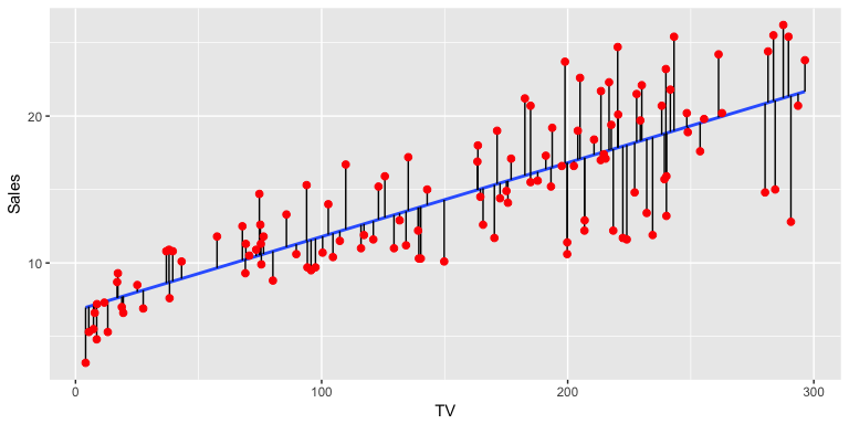
In the background the lm, which stands for “linear model”, is producing the best-fit linear relationship by minimizing the least squares criterion (alternative approaches will be considered in later tutorials). This fit can be visualized in the following illustration where the “best-fit” line is found by minimizing the sum of squared errors (the errors are represented by the vertical black line segments).
For initial assessment of our model we can use summary. This provides us with a host of information about our model, which we’ll walk through. Alternatively, you can also use glance(model1) to get a “tidy” result output.
summary(model1)
##
## Call:
## lm(formula = Sales ~ TV, data = train)
##
## Residuals:
##     Min      1Q  Median      3Q     Max
## -8.5816 -1.7845 -0.2533  2.1715  6.9345
##
## Coefficients:
##             Estimate Std. Error t value Pr(>|t|)
## (Intercept) 6.764098   0.607592   11.13   <2e-16 ***
## TV          0.050284   0.003463   14.52   <2e-16 ***
## ---
## Signif. codes:  0 '***' 0.001 '**' 0.01 '*' 0.05 '.' 0.1 ' ' 1
##
## Residual standard error: 3.204 on 120 degrees of freedom
## Multiple R-squared:  0.6373,	Adjusted R-squared:  0.6342
## F-statistic: 210.8 on 1 and 120 DF,  p-value: < 2.2e-16
Our original formula in Eq. (1) includes for our intercept coefficent and for our slope coefficient. If we look at our model results (here we use tidy to just print out a tidy version of our coefficent results) we see that our model takes the form of
tidy(model1)
##          term   estimate std.error statistic      p.value
## 1 (Intercept) 6.76409784 0.6075916  11.13264 3.307215e-20
## 2          TV 0.05028368 0.0034632  14.51943 3.413075e-28
In other words, our intercept estimate is 6.76 so when the TV advertising budget is zero we can expect sales to be 6,760 (remember we’re operating in units of 1,000). And for every $1,000 increase in the TV advertising budget we expect the average increase in sales to be 50 units.
It’s also important to understand if the these coefficients are statistically significant. In other words, can we state these coefficients are statistically different then 0? To do that we can start by assessing the standard error (SE). The SE for and are computed with:
where . We see that our model results provide the SE (noted as std.error). We can use the SE to compute the 95% confidence interval for the coefficients:
To get this information in R we can simply use:
confint(model1)
##                  2.5 %     97.5 %
## (Intercept) 5.56110868 7.96708701
## TV          0.04342678 0.05714057
Our results show us that our 95% confidence interval for (TV) is [.043, .057]. Thus, since zero is not in this interval we can conclude that as the TV advertising budget increases by $1,000 we can expect the sales to increase by 43-57 units. This is also supported by the t-statistic provided by our results, which are computed by
which measures the number of standard deviations that is away from 0. Thus a large t-statistic such as ours will produe a small p-value (a small p-value indicates that it is unlikely to observe such a substantial association between the predictor variable and the response due to chance). Thus, we can conclude that a relationship between TV advertising budget and sales exists.
Next, we want to understand the extent to which the model fits the data. This is typically referred to as the goodness-of-fit. We can measure this quantitatively by assessing three things:
The RSE is an estimate of the standard deviation of . Roughly speaking, it is the average amount that the response will deviate from the true regression line. It is computed by:
We get the RSE at the bottom of summary(model1), we can also get it directly with
sigma(model1)
## [1] 3.204129
An RSE value of 3.2 means the actual sales in each market will deviate from the true regression line by approximately 3,200 units, on average. Is this significant? Well, that’s subjective but when compared to the average value of sales over all markets the percentage error is 22%:
sigma(model1)/mean(train$Sales)
## [1] 0.2207373
The RSE provides an absolute measure of lack of fit of our model to the data. But since it is measured in the units of , it is not always clear what constitutes a good RSE. The statistic provides an alternative measure of fit. It represents the proportion of variance explained and so it always takes on a value between 0 and 1, and is independent of the scale of . is simply a function of residual sum of squares (RSS) and total sum of squares (TSS):
Similar to RSE the can be found at the bottom of summary(model1) but we can also get it directly with rsquare. The result suggests that TV advertising budget can explain 64% of the variability in our sales data.
rsquare(model1, data = train)
## [1] 0.6372581
As a side note, in a simple linear regression model the value will equal the squared correlation between and :
cor(train$TV, train$Sales)^2
## [1] 0.6372581
Lastly, the F-statistic tests to see if at least one predictor variable has a non-zero coefficient. This becomes more important once we start using multiple predictors as in multiple linear regression; however, we’ll introduce it here. The F-statistic is computed as:
Hence, a larger F-statistic will produce a statistically significant p-value (). In our case we see at the bottom of our summary statement that the F-statistic is 210.8 producing a p-value of .
Combined, our RSE, , and F-statistic results suggest that our model has an ok fit, but we could likely do better.
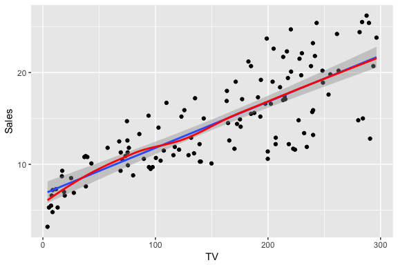
Not only is it important to understand quantitative measures regarding our coefficient and model accuracy but we should also understand visual approaches to assess our model. First, we should always visualize our model within our data when possible. For simple linear regression this is quite simple. Here we use geom_smooth(method = "lm") followed by geom_smooth(). This allows us to compare the linearity of our model (blue line with the 95% confidence interval in shaded region) with a non-linear LOESS model. Considering the LOESS smoother remains within the confidence interval we can assume the linear trend fits the essence of this relationship. However, we do note that as the TV advertising budget gets closer to 0 there is a stronger reduction in sales beyond what the linear trend follows.
ggplot(train, aes(TV, Sales)) +
  geom_point() +
  geom_smooth(method = "lm") +
  geom_smooth(se = FALSE, color = "red")
An important part of assessing regression models is visualizing residuals. If you use plot(model1) four residual plots will be produced that provide some insights. Here I’ll walk through creating each of these plots within ggplot and explain their insights.
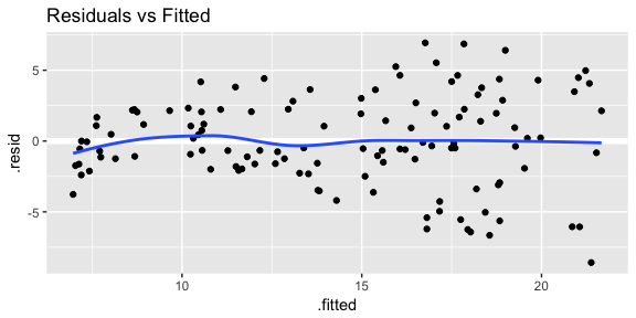
First is a plot of residuals versus fitted values. This will signal two important concerns:
# add model diagnostics to our training data
model1_results <- augment(model1, train)

ggplot(model1_results, aes(.fitted, .resid)) +
  geom_ref_line(h = 0) +
  geom_point() +
  geom_smooth(se = FALSE) +
  ggtitle("Residuals vs Fitted")
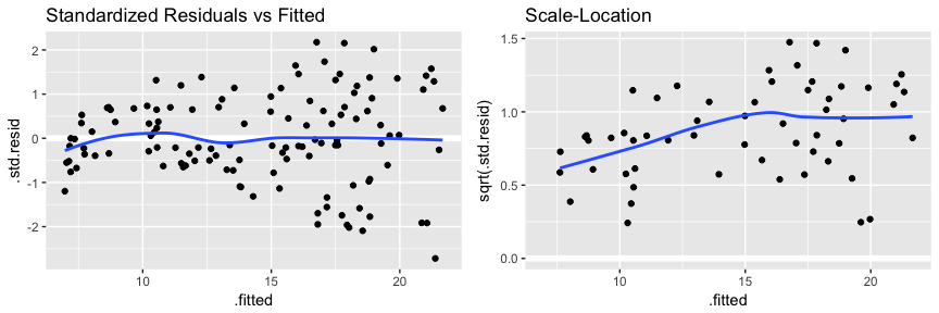
We can get this same kind of information with a couple other plots which you will see when using plot(model1). The first is comparing standardized residuals versus fitted values. This is the same plot as above but with the residuals standardized to show where residuals deviate by 1, 2, 3+ standard deviations. This helps us to identify outliers that exceed 3 standard deviations. The second is the scale-location plot. This plot shows if residuals are spread equally along the ranges of predictors. This is how you can check the assumption of equal variance (homoscedasticity). It’s good if you see a horizontal line with equally (randomly) spread points.
p1 <- ggplot(model1_results, aes(.fitted, .std.resid)) +
  geom_ref_line(h = 0) +
  geom_point() +
  geom_smooth(se = FALSE) +
  ggtitle("Standardized Residuals vs Fitted")

p2 <- ggplot(model1_results, aes(.fitted, sqrt(.std.resid))) +
  geom_ref_line(h = 0) +
  geom_point() +
  geom_smooth(se = FALSE) +
  ggtitle("Scale-Location")

gridExtra::grid.arrange(p1, p2, nrow = 1)
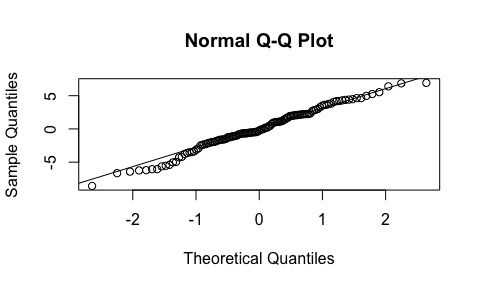
The next plot assess the normality of our residuals. A Q-Q plot plots the distribution of our residuals against the theoretical normal distribution. The closer the points are to falling directly on the diagonal line then the more we can interpret the residuals as normally distributed. If there is strong snaking or deviations from the diagonal line then we should consider our residuals non-normally distributed. In our case we have a little deviation in the bottom left-hand side which likely is the concern we mentioned earlier that as the TV advertising budget approaches 0 the relationship with sales appears to start veering away from a linear relationship.
qq_plot <- qqnorm(model1_results$.resid)
qq_plot <- qqline(model1_results$.resid)
Last are the Cook’s Distance and residuals versus leverage plot. These plot helps us to find influential cases (i.e., subjects) if any. Not all outliers are influential in linear regression analysis. Even though data have extreme values, they might not be influential to determine a regression line. That means, the results wouldn’t be much different if we either include or exclude them from analysis. They follow the trend in the majority of cases and they don’t really matter; they are not influential. On the other hand, some cases could be very influential even if they look to be within a reasonable range of the values. They could be extreme cases against a regression line and can alter the results if we exclude them from analysis. Another way to put it is that they don’t get along with the trend in the majority of the cases.
Here we are looking for outlying values (we can select the top n outliers to report with id.n. The identified (labeled) points represent those splots where cases can be influential against a regression line. When cases have high Cook’s distance scores and are to the upper or lower right of our leverage plot they have leverage meaning they are influential to the regression results. The regression results will be altered if we exclude those cases.
par(mfrow=c(1, 2))

plot(model1, which = 4, id.n = 5)
plot(model1, which = 5, id.n = 5)
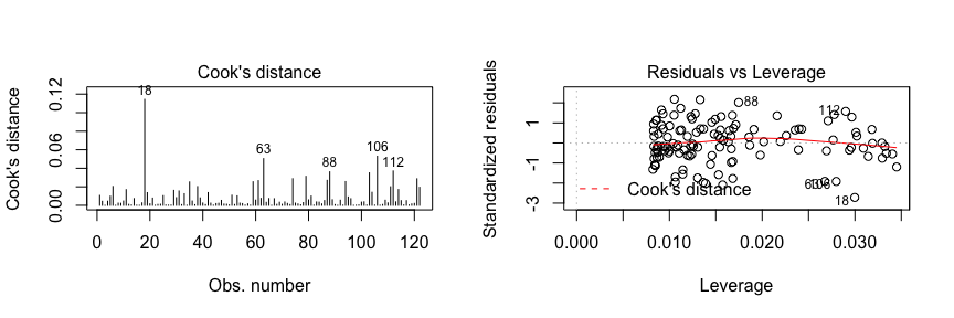
If you want to look at these top 5 observations with the highest Cook’s distance in case you want to assess them further you can use the following.
model1_results %>%
  top_n(5, wt = .cooksd)
##      TV Radio Newspaper Sales  .fitted   .se.fit    .resid       .hat   .sigma    .cooksd .std.resid
## 1 290.7   4.1       8.5  12.8 21.38156 0.5547697 -8.581562 0.02997819 3.116848 0.11426815  -2.719353
## 2 280.2  10.1      21.4  14.8 20.85358 0.5241186 -6.053584 0.02675710 3.168012 0.05041639  -1.915102
## 3 243.2  49.0      44.3  25.4 18.99309 0.4233792  6.406912 0.01745979 3.162537 0.03615646   2.017268
## 4 284.3  10.6       6.4  15.0 21.05975 0.5360021 -6.059747 0.02798421 3.167847 0.05296944  -1.918262
## 5 287.6  43.0      71.8  26.2 21.22568 0.5456473  4.974317 0.02900041 3.184113 0.03706661   1.575484
So, what does having patterns in residuals mean to your research? It’s not just a go-or-stop sign. It tells you about your model and data. Your current model might not be the best way to understand your data if there’s so much good stuff left in the data.
In that case, you may want to go back to your theory and hypotheses. Is it really a linear relationship between the predictors and the outcome? You may want to include a quadratic term, for example. A log transformation may better represent the phenomena that you’d like to model. Or, is there any important variable that you left out from your model? Other variables you didn’t include (e.g., Radio or Newspaper advertising budgets) may play an important role in your model and data. Or, maybe, your data were systematically biased when collecting data. You may want to redesign data collection methods.
Checking residuals is a way to discover new insights in your model and data!
Often the goal with regression approaches is to make predictions on new data. To assess how well our model will do in this endeavor we need to assess how it does in making predictions against our test data set. This informs us how well our model generalizes to data outside our training set. We can use our model to predict Sales values for our test data by using add_predictions.
(test <- test %>%
  add_predictions(model1))
## # A tibble: 78 × 5
##       TV Radio Newspaper Sales      pred
##    <dbl> <dbl>     <dbl> <dbl>     <dbl>
## 1   44.5  39.3      45.1  10.4  9.001721
## 2  151.5  41.3      58.5  18.5 14.382075
## 3  180.8  10.8      58.4  12.9 15.855386
## 4  120.2  19.6      11.6  13.2 12.808196
## 5   66.1   5.8      24.2   8.6 10.087849
## 6   23.8  35.1      65.9   9.2  7.960849
## 7  195.4  47.7      52.9  22.4 16.589528
## 8  147.3  23.9      19.1  14.6 14.170883
## 9  218.4  27.7      53.4  18.0 17.746053
## 10 237.4   5.1      23.5  12.5 18.701442
## # ... with 68 more rows
The primary concern is to assess if the out-of-sample mean squared error (MSE), also known as the mean squared prediction error, is substantially higher than the in-sample mean square error, as this is a sign of deficiency in the model. The MSE is computed as
We can easily compare the test sample MSE to the training sample MSE with the following. The difference is not that significant. However, this practice becomes more powerful when you are comparing multiple models. For example, if you developed a simple linear model with just the Radio advertising budget as the predictor variable, you could then compare our two different simple linear models and the one that produces the lowest test sample MSE is the preferred model.
# test MSE
test %>%
  add_predictions(model1) %>%
  summarise(MSE = mean((Sales - pred)^2))
## # A tibble: 1 × 1
##        MSE
##      <dbl>
## 1 11.34993

# training MSE
train %>%
  add_predictions(model1) %>%
  summarise(MSE = mean((Sales - pred)^2))
## # A tibble: 1 × 1
##        MSE
##      <dbl>
## 1 10.09814
In the next tutorial we will look at how we can extend a simple linear regression model into a multiple regression.
Simple linear regression is a useful approach for predicting a response on the basis of a single predictor variable. However, in practice we often have more than one predictor. For example, in the Advertising data, we have examined the relationship between sales and TV advertising. We also have data for the amount of money spent advertising on the radio and in newspapers, and we may want to know whether either of these two media is associated with sales. How can we extend our analysis of the advertising data in order to accommodate these two additional predictors?
We can extend the simple linear regression model so that it can directly accommodate multiple predictors. We can do this by giving each predictor a separate slope coefficient in a single model. In general, suppose that we have p distinct predictors. Then the multiple linear regression model takes the form
where represents the jth predictor and quantifies the association between that variable and the response. We interpret as the average effect on of a one unit increase in , holding all other predictors fixed.
If we want to run a model that uses TV, Radio, and Newspaper to predict Sales then we build this model in R using a similar approach introduced in the Simple Linear Regression tutorial.
model2 <- lm(Sales ~ TV + Radio + Newspaper, data = train)
We can also assess this model as before:
summary(model2)
##
## Call:
## lm(formula = Sales ~ TV + Radio + Newspaper, data = train)
##
## Residuals:
##     Min      1Q  Median      3Q     Max
## -4.8426 -0.6466  0.2165  1.0640  2.6804
##
## Coefficients:
##              Estimate Std. Error t value Pr(>|t|)
## (Intercept)  2.822206   0.369369   7.641 6.29e-12 ***
## TV           0.047362   0.001657  28.577  < 2e-16 ***
## Radio        0.196375   0.010347  18.979  < 2e-16 ***
## Newspaper   -0.010593   0.006460  -1.640    0.104
## ---
## Signif. codes:  0 '***' 0.001 '**' 0.01 '*' 0.05 '.' 0.1 ' ' 1
##
## Residual standard error: 1.527 on 118 degrees of freedom
## Multiple R-squared:  0.9189,	Adjusted R-squared:  0.9169
## F-statistic: 445.9 on 3 and 118 DF,  p-value: < 2.2e-16
The interpretation of our coefficients is the same as in a simple linear regression model. First, we see that our coefficients for TV and Radio advertising budget are statistically significant (p-value < 0.05) while the coefficient for Newspaper is not. Thus, changes in Newspaper budget do not appear to have a relationship with changes in sales. However, for TV our coefficent suggests that for every $1,000 increase in TV advertising budget, holding all other predictors constant, we can expect an increase of 47 sales units, on average (this is similar to what we found in the simple linear regression). The Radio coefficient suggests that for every $1,000 increase in Radio advertising budget, holding all other predictors constant, we can expect an increase of 196 sales units, on average.
tidy(model2)
##          term    estimate   std.error statistic      p.value
## 1 (Intercept)  2.82220600 0.369369200   7.64061 6.292503e-12
## 2          TV  0.04736209 0.001657356  28.57690 7.360519e-55
## 3       Radio  0.19637507 0.010346756  18.97939 1.171088e-37
## 4   Newspaper -0.01059255 0.006460332  -1.63963 1.037455e-01
We can also get our confidence intervals around these coefficient estimates as we did before. Here we see how the confidence interval for Newspaper includes 0 which suggests that we cannot assume the coefficient estimate of -0.0106 is different than 0.
confint(model2)
##                   2.5 %      97.5 %
## (Intercept)  2.09075443 3.553657581
## TV           0.04408008 0.050644109
## Radio        0.17588568 0.216864467
## Newspaper   -0.02338577 0.002200661
Assessing model accuracy is very similar as when assessing simple linear regression models. Rather than repeat the discussion, here I will highlight a few key considerations. First, multiple regression is when the F-statistic becomes more important as this statistic is testing to see if at least one of the coefficients is non-zero. When there is no relationship between the response and predictors, we expect the F-statistic to take on a value close to 1. On the other hand, if at least predictor has a relationship then we expect . In our summary print out above for model 2 we saw that with suggesting that at least one of the advertising media must be related to sales.
In addition, if we compare the results from our simple linear regression model (model1) and our multiple regression model (model2) we can make some important comparisons:
list(model1 = broom::glance(model1), model2 = broom::glance(model2))
## $model1
##   r.squared adj.r.squared    sigma statistic      p.value df    logLik      AIC      BIC deviance df.residual
## 1 0.6372581     0.6342353 3.204129  210.8137 3.413075e-28  2 -314.1639 634.3279 642.7399 1231.973         120
##
## $model2
##   r.squared adj.r.squared    sigma statistic      p.value df    logLik      AIC      BIC deviance df.residual
## 1 0.9189394     0.9168785 1.527446  445.9001 3.486405e-64  4 -222.7558 455.5116 469.5317 275.3046         118
sigma) is lower than model 1. This shows that model 2 reduces the variance of our parameter which corroborates our conclusion that model 2 does a better job modeling sales.statistic) in model 2 is larger than model 1. Here larger is better and suggests that model 2 provides a better “goodness-of-fit”.So we understand that quantitative attributes of our second model suggest it is a better fit, how about visually?
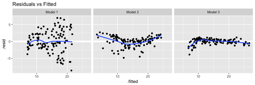
Our main focus is to assess and compare residual behavior with our models. First, if we compare model 2’s residuals versus fitted values we see that model 2 has reduced concerns with heteroskedasticity; however, we now have discernible patter suggesting concerns of linearity. We’ll see one way to address this in the next section.
# add model diagnostics to our training data
model1_results <- model1_results %>%
  mutate(Model = "Model 1")

model2_results <- augment(model2, train) %>%
  mutate(Model = "Model 2") %>%
  rbind(model1_results)

ggplot(model2_results, aes(.fitted, .resid)) +
  geom_ref_line(h = 0) +
  geom_point() +
  geom_smooth(se = FALSE) +
  facet_wrap(~ Model) +
  ggtitle("Residuals vs Fitted")
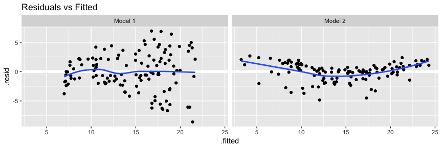
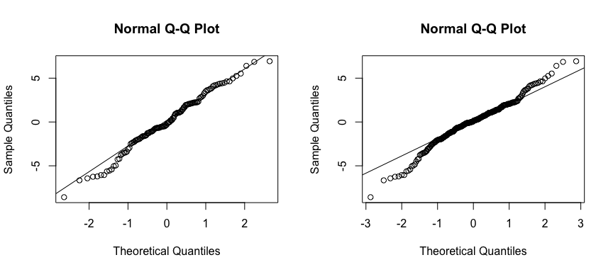
This concern with normality is supported when we compare the Q-Q plots. So although our model is performing better numerically, we now have a greater concern with normality then we did before! This is why we must always assess models numerically and visually!
par(mfrow=c(1, 2))

# Left: model 1
qqnorm(model1_results$.resid); qqline(model1_results$.resid)

# Right: model 2
qqnorm(model2_results$.resid); qqline(model2_results$.resid)
To see how our models compare when making predictions on an out-of-sample data set we’ll compare MSE. Here we can use gather_predictions to predict on our test data with both models and then, as before, compute the MSE. Here we see that model 2 drastically reduces MSE on the out-of-sample. So although we still have lingering concerns over residual normality model 2 is still the preferred model so far.
test %>%
  gather_predictions(model1, model2) %>%
  group_by(model) %>%
  summarise(MSE = mean((Sales-pred)^2))
## # A tibble: 2 × 2
##    model      MSE
##    <chr>    <dbl>
## 1 model1 11.34993
## 2 model2  3.75494
In our previous analysis of the Advertising data, we concluded that both TV and radio seem to be associated with sales. The linear models that formed the basis for this conclusion assumed that the effect on sales of increasing one advertising medium is independent of the amount spent on the other media. For example, the linear model (Eq. 10) states that the average effect on sales of a one-unit increase in TV is always , regardless of the amount spent on radio.
However, this simple model may be incorrect. Suppose that spending money on radio advertising actually increases the effectiveness of TV advertising, so that the slope term for TV should increase as radio increases. In this situation, given a fixed budget of $100,000, spending half on radio and half on TV may increase sales more than allocating the entire amount to either TV or to radio. In marketing, this is known as a synergy effect, and in statistics it is referred to as an interaction effect. One way of extending our model 2 to allow for interaction effects is to include a third predictor, called an interaction term, which is constructed by computing the product of and (here we’ll drop the Newspaper variable). This results in the model
Now the effect of on is no longer constant as adjusting will change the impact of on . We can interpret as the increase in the effectiveness of TV advertising for a one unit increase in radio advertising (or vice-versa). To perform this in R we can use either of the following. Note that option B is a shorthand version as when you create the interaction effect with *, R will automatically retain the main effects.
# option A
model3 <- lm(Sales ~ TV + Radio + TV * Radio, data = train)

# option B
model3 <- lm(Sales ~ TV * Radio, data = train)
We see that all our coefficients are statistically significant. Now we can interpret this as an increase in TV advertising of $1,000 is associated with increased sales of . And an increase in Radio advertising of $1,000 will be associated with an increase in sales of .
tidy(model3)
##          term    estimate    std.error statistic      p.value
## 1 (Intercept) 6.497388545 3.078842e-01 21.103355 7.247874e-42
## 2          TV 0.020790280 1.875342e-03 11.086126 5.251042e-20
## 3       Radio 0.039032099 1.058511e-02  3.687455 3.437776e-04
## 4    TV:Radio 0.001014227 6.208425e-05 16.336294 4.468987e-32
We can compare our model results across all three models. We see that our adjusted and F-statistic are highest with model 3 and our RSE, AIC, and BIC are the lowest with model 3; all suggesting the model 3 out performs the other models.
list(model1 = broom::glance(model1),
     model2 = broom::glance(model2),
     model3 = broom::glance(model3))
## $model1
##   r.squared adj.r.squared    sigma statistic      p.value df    logLik      AIC      BIC deviance df.residual
## 1 0.6372581     0.6342353 3.204129  210.8137 3.413075e-28  2 -314.1639 634.3279 642.7399 1231.973         120
##
## $model2
##   r.squared adj.r.squared    sigma statistic      p.value df    logLik      AIC      BIC deviance df.residual
## 1 0.9189394     0.9168785 1.527446  445.9001 3.486405e-64  4 -222.7558 455.5116 469.5317 275.3046         118
##
## $model3
##   r.squared adj.r.squared     sigma statistic      p.value df    logLik      AIC      BIC deviance df.residual
## 1 0.9745811     0.9739349 0.8553403  1508.073 6.908026e-94  4 -152.0138 314.0275 328.0476 86.32963         118
Visually assessing our residuals versus fitted values we see that model three does a better job with constant variance and, with the exception of the far left side, does not have any major signs of non-normality.
# add model diagnostics to our training data
model3_results <- augment(model3, train) %>%
  mutate(Model = "Model 3") %>%
  rbind(model2_results)

ggplot(model3_results, aes(.fitted, .resid)) +
  geom_ref_line(h = 0) +
  geom_point() +
  geom_smooth(se = FALSE) +
  facet_wrap(~ Model) +
  ggtitle("Residuals vs Fitted")
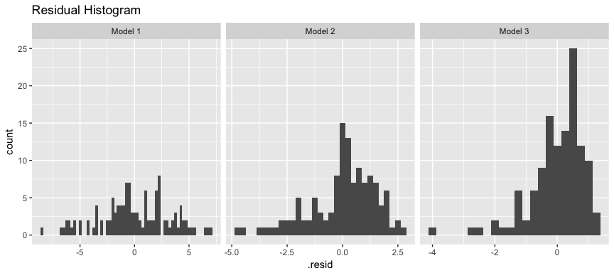
As an alternative to the Q-Q plot we can also look at residual histograms for each model. Here we see that model 3 has a couple large left tail residuals. These are related to the left tail dip we saw in the above plots.
ggplot(model3_results, aes(.resid)) +
  geom_histogram(binwidth = .25) +
  facet_wrap(~ Model, scales = "free_x") +
  ggtitle("Residual Histogram")
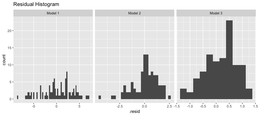
These residuals can be tied back to when our model is trying to predict low levels of sales (< 10,000). If we remove these sales our residuals are more normally distributed. What does this mean? Basically our linear model does a good job predicting sales over 10,000 units based on TV and Radio advertising budgets; however, the performance deteriates when trying to predict sales less than 10,000 because our linear assumption does not hold for this segment of our data.
model3_results %>%
  filter(Sales > 10) %>%
  ggplot(aes(.resid)) +
  geom_histogram(binwidth = .25) +
  facet_wrap(~ Model, scales = "free_x") +
  ggtitle("Residual Histogram")
This can be corroborated by looking at the Cook’s Distance and Leverage plots. Both of them highlight observations 3, 5, 47, 65, and 94 as the top 5 influential observations.
par(mfrow=c(1, 2))

plot(model3, which = 4, id.n = 5)
plot(model3, which = 5, id.n = 5)
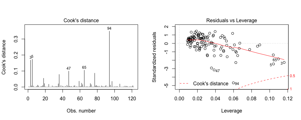
If we look at these observations we see that they all have low Sales levels.
train[c(3, 5, 47, 65, 94),]
## # A tibble: 5 × 4
##      TV Radio Newspaper Sales
##   <dbl> <dbl>     <dbl> <dbl>
## 1   8.7  48.9      75.0   7.2
## 2   8.6   2.1       1.0   4.8
## 3   5.4  29.9       9.4   5.3
## 4  13.1   0.4      25.6   5.3
## 5   4.1  11.6       5.7   3.2
Again, to see how our models compare when making predictions on an out-of-sample data set we’ll compare the MSEs across all our models. Here we see that model 3 has the lowest out-of-sample MSE, further supporting the case that it is the best model and has not overfit our data.
test %>%
  gather_predictions(model1, model2, model3) %>%
  group_by(model) %>%
  summarise(MSE = mean((Sales-pred)^2))
## # A tibble: 3 × 2
##    model       MSE
##    <chr>     <dbl>
## 1 model1 11.349934
## 2 model2  3.754940
## 3 model3  1.153139
In our discussion so far, we have assumed that all variables in our linear regression model are quantitative. But in practice, this is not necessarily the case; often some predictors are qualitative.
For example, the Credit data set records balance (average credit card debt for a number of individuals) as well as several quantitative predictors: age, cards (number of credit cards), education (years of education), income (in thousands of dollars), limit (credit limit), and rating (credit rating).
Suppose that we wish to investigate differences in credit card balance between males and females, ignoring the other variables for the moment. If a qualitative predictor (also known as a factor) only has two levels, or possible values, then incorporating it into a regression model is very simple. We simply create an indicator or dummy variable that takes on two possible numerical values. For example, based on the gender, we can create a new variable that takes the form
and use this variable as a predictor in the regression equation. This results in the model
Now can be interpreted as the average credit card balance among males, as the average credit card balance among females, and as the average difference in credit card balance between females and males. We can produce this model in R using the same syntax as we saw earlier:
credit <- read_csv("http://www-bcf.usc.edu/~gareth/ISL/Credit.csv")
model4 <- lm(Balance ~ Gender, data = credit)
The results below suggest that females are estimated to carry $529.54 in credit card debt where males carry $529.54 - $19.73 = $509.81.
tidy(model4)
##          term  estimate std.error  statistic      p.value
## 1 (Intercept) 529.53623  31.98819 16.5541153 3.312981e-47
## 2  GenderMale -19.73312  46.05121 -0.4285039 6.685161e-01
The decision to code females as 0 and males as 1 in is arbitrary, and has no effect on the regression fit, but does alter the interpretation of the coefficients. If we want to change the reference variable (the variable coded as 0) we can change the factor levels.
credit$Gender <- factor(credit$Gender, levels = c("Male", "Female"))

lm(Balance ~ Gender, data = credit) %>%
  tidy()
##           term  estimate std.error  statistic      p.value
## 1  (Intercept) 509.80311  33.12808 15.3888531 2.908941e-42
## 2 GenderFemale  19.73312  46.05121  0.4285039 6.685161e-01
A similar process ensues for qualitative predictor categories with more than two levels. For instance, if we want to assess the impact that ethnicity has on credit balance we can run the following model. Ethnicity has three levels: African American, Asian, Caucasian. We interpret the coefficients much the same way. In this case we see that the estimated balance for the baseline, African American, is $531.00. It is estimated that the Asian category will have $18.69 less debt than the African American category, and that the Caucasian category will have $12.50 less debt than the African American category. However, the p-values associated with the coefficient estimates for the two dummy variables are very large, suggesting no statistical evidence of a real difference in credit card balance between the ethnicities.
lm(Balance ~ Ethnicity, data = credit) %>%
  tidy
##                 term  estimate std.error  statistic      p.value
## 1        (Intercept) 531.00000  46.31868 11.4640565 1.774117e-26
## 2     EthnicityAsian -18.68627  65.02107 -0.2873880 7.739652e-01
## 3 EthnicityCaucasian -12.50251  56.68104 -0.2205766 8.255355e-01
The process for assessing model accuracy, both numerically and visually, along with making and measuring predictions can follow the same process as outlined for quantitative predictor variables.
Linear regression models assume a linear relationship between the response and predictors. But in some cases, the true relationship between the response and the predictors may be non-linear. We can accomodate certain non-linear relationships by transforming variables (i.e. log(x), sqrt(x)) or using polynomial regression.
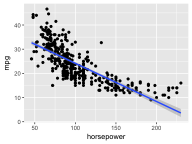
As an example consider the Auto data set. We can see that a linear trend does not fit the relationship between mpg and horsepower.
auto <- ISLR::Auto

ggplot(auto, aes(horsepower, mpg)) +
  geom_point() +
  geom_smooth(method = "lm")
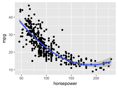
We can try to address the non-linear relationship with a quadratic relationship, which takes the form of:
We can fit this model in R with:
model5 <- lm(mpg ~ horsepower + I(horsepower^2), data = auto)

tidy(model5)
##              term     estimate    std.error statistic       p.value
## 1     (Intercept) 56.900099702 1.8004268063  31.60367 1.740911e-109
## 2      horsepower -0.466189630 0.0311246171 -14.97816  2.289429e-40
## 3 I(horsepower^2)  0.001230536 0.0001220759  10.08009  2.196340e-21
Does this fit our relationship better? We can visualize it with:
ggplot(auto, aes(horsepower, mpg)) +
  geom_point() +
  geom_smooth(method = "lm", formula = y ~ x + I(x^2))
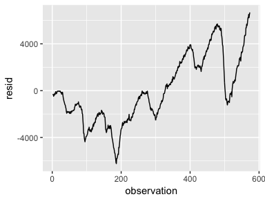
An important assumption of the linear regression model is that the error terms, , are uncorrelated. Correlated residuals frequently occur in the context of time series data, which consists of observations for which measurements are obtained at discrete points in time. In many cases, observations that are obtained at adjacent time points will have positively correlated errors. This will result in biased standard errors and incorrect inference of model results.
To illustrate, we’ll create a model that uses the number of unemployed to predict personal consumption expenditures (using the economics data frame provided by ggplot2). The assumption is that as more people become unemployed personal consumption is likely to reduce. However, if we look at our model’s residuals we see that adjacent residuals tend to take on similar values. In fact, these residuals have a .998 autocorrelation. This is a clear violation of our assumption. We’ll learn how to deal with correlated residuals in future tutorials.
df <- economics %>%
  mutate(observation = 1:n())

model6 <- lm(pce ~ unemploy, data = df)

df %>%
  add_residuals(model6) %>%
  ggplot(aes(observation, resid)) +
  geom_line()
Collinearity refers to the situation in which two or more predictor variables are closely related to one another. The presence of collinearity can pose problems in the regression context, since it can be difficult to separate out the individual effects of collinear variables on the response. In fact, collinearity can cause predictor variables to appear as statistically insignificant when in fact they are significant.
For example, compares the coefficient estimates obtained from two separate multiple regression models. The first is a regression of balance on age and limit, and the second is a regression of balance on rating and limit. In the first regression, both age and limit are highly significant with very small p- values. In the second, the collinearity between limit and rating has caused the standard error for the limit coefficient estimate to increase by a factor of 12 and the p-value to increase to 0.701. In other words, the importance of the limit variable has been masked due to the presence of collinearity.
model7 <- lm(Balance ~ Age + Limit, data = credit)
model8 <- lm(Balance ~ Rating + Limit, data = credit)

list(`Model 1` = tidy(model7),
     `Model 2` = tidy(model8))
## $`Model 1`
##          term    estimate    std.error statistic       p.value
## 1 (Intercept) -173.410901 43.828387048 -3.956589  9.005366e-05
## 2         Age   -2.291486  0.672484540 -3.407492  7.226468e-04
## 3       Limit    0.173365  0.005025662 34.495944 1.627198e-121
##
## $`Model 2`
##          term      estimate   std.error  statistic      p.value
## 1 (Intercept) -377.53679536 45.25417619 -8.3425846 1.213565e-15
## 2      Rating    2.20167217  0.95229387  2.3119672 2.129053e-02
## 3       Limit    0.02451438  0.06383456  0.3840298 7.011619e-01
A simple way to detect collinearity is to look at the correlation matrix of the predictors. An element of this matrix that is large in absolute value indicates a pair of highly correlated variables, and therefore a collinearity problem in the data. Unfortunately, not all collinearity problems can be detected by inspection of the correlation matrix: it is possible for collinear- ity to exist between three or more variables even if no pair of variables has a particularly high correlation. We call this situation multicollinearity.
Instead of inspecting the correlation matrix, a better way to assess multi- collinearity is to compute the variance inflation factor (VIF). The VIF is the ratio of the variance of when fitting the full model divided by the variance of if fit on its own. The smallest possible value for VIF is 1, which indicates the complete absence of collinearity. Typically in practice there is a small amount of collinearity among the predictors. As a rule of thumb, a VIF value that exceeds 5 or 10 indicates a problematic amount of collinearity. The VIF for each variable can be computed using the formula
where is the from a regression of onto all of the other predictors. We can use the vif function from the car package to compute the VIF. As we see below model 7 is near the smallest possible VIF value where model 8 has obvious concerns.
car::vif(model7)
##      Age    Limit
## 1.010283 1.010283
car::vif(model8)
##   Rating    Limit
## 160.4933 160.4933
This tutorial was built as a supplement to Chapter 3 of An Introduction to Statistical Learning ↩