
In the univariate statistical inference tutorial we focused on inference methods for one variable at a time. However, analysts are often interested in multivariate inferential methods where comparisons between two or more groups can be assessed. This tutorial builds on the previous one by illustrating common approaches to perform multivariate statistical inference.
First, I provide the data and packages required to replicate the analysis and then I walk through the basic operations to compare means and proportions between two or more groups.
This tutorial primarily uses base R functions; however, we leverage ggplot2 and dplyr for some basic data manipulation and visualization tasks. To illustrate the key ideas, we use employee attrition data provided by the rsample package
# packages used regularly
library(ggplot2)
library(dplyr)

# full population data
attrition <- rsample::attrition
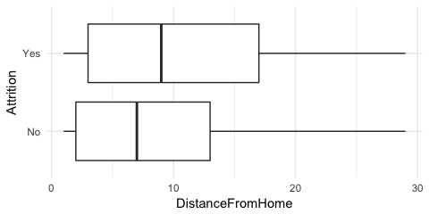
Often we are interested in how values for a given variable differ between two groups. For example, we may wonder if driving distances to and from work may be related to employee attrition. The summary statistics are given below, which suggest employees that churn may, on average, live about 1.5 miles further from work than employees that do not churn.
attrition %>%
  group_by(Attrition) %>%
  summarise(
    avg_dst = mean(DistanceFromHome),
    sd_dst  = sd(DistanceFromHome),
    n       = n()
  )
## # A tibble: 2 x 4
##   Attrition avg_dst sd_dst     n
##   <fctr>      <dbl>  <dbl> <int>
## 1 No           8.92   8.01  1233
## 2 Yes         10.6    8.45   237
We can also illustrate this with a boxplot
ggplot(attrition, aes(Attrition, DistanceFromHome)) +
  geom_boxplot() +
  coord_flip()
However, the question remains, how certain are we that there is a difference in distances between the two attrition groups? Assuming this data is a sample of a larger population data set, we saw in the previous tutorial that there is some uncertainty (margin of error) around the estimated mean produced by a sample. If the margin of error is large enough then we cannot state that any differences in mean values between these groups are statistically significant. This results in the following hypothesis:
where the null hypothesis is that the average distances are the same between the two groups of employees and the alternative is that they differ. To assess this hypothesis we can test for the difference in group means by using the two-sample test statistic
which follows an approximate t distribution with the smaller of or degrees of freedom. For t to be applicable, either both groups need to be normally distributed or both groups need to have sufficiently large sample sizes. The same logic applies for this test statistic as those in the previous tutorial → a sufficiently large t value provides evidence against the null hypothesis and this strength of evidence can be measured by the p-value.
We apply this in R using t.test. The p-value results suggest very strong evidence that the two groups are different. The difference of the two means is and the confidence interval suggests that we can be 95% certain that the true difference between these groups rests in the interval of -2.89 and -0.55 miles. Consequently, we can state that, on average, employees that churn tend to live further away from work than employees that do not churn.
t.test(DistanceFromHome ~ Attrition, data = attrition)
##
## 	Welch Two Sample t-test
##
## data:  DistanceFromHome by Attrition
## t = -2.8882, df = 322.72, p-value = 0.004137
## alternative hypothesis: true difference in means is not equal to 0
## 95 percent confidence interval:
##  -2.8870025 -0.5475146
## sample estimates:
##  mean in group No mean in group Yes
##          8.915653         10.632911
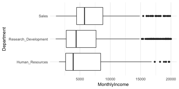
An extension of the two-sample t-test is if we desire to compare three or more groups. Suppose we are interested in comparing the average monthly income across the departments in our attrition data. We can see that incomes are relatively close ranging from $6,281-$6,959.
attrition %>%
  group_by(Department) %>%
  summarise(
    avg_inc = mean(MonthlyIncome),
    sd_inc  = sd(MonthlyIncome),
    n       = n()
  )
## # A tibble: 3 x 4
##   Department           avg_inc sd_inc     n
##   <fctr>                 <dbl>  <dbl> <int>
## 1 Human_Resources         6655   5789    63
## 2 Research_Development    6281   4896   961
## 3 Sales                   6959   4059   446
And we can visualize the distributions, which suggests that there may be evidence suggesting the average monthly income for the sales department is higher than one or both of the other two.
ggplot(attrition, aes(Department, MonthlyIncome)) +
  geom_boxplot() +
  coord_flip()
Consequently, the hypothesis we make here is:
We can turn to analysis of variance (ANOVA) to assess this hypothesis. ANOVA works by comparing:
When (1) is much larger than (2), this represents evidence that the population means are not equal (). Thus, the approach depends on variability, hence the term analysis of variance.
Let represent the mean of all observations from all groups. We measure the between-sample variability by finding the variance of the k sample means, weighted by sample size, and expressed as the mean square treatment (MSTR):
We measure the within-sample variability by finding the weighted mean of the sample variances, expressed as the mean square error (MSE):
We compare these two quantities by taking their ratio, called the F statistic:
which follows an F distribution, with degrees of freedom and . The numerator of MSTR is also known as the sum of squares treament (SSTR) and the numerator of MSE is known as the sum of squares error (SSE). The total sum of the squares (SST) is the sum of SSTR and SSE. These quantities are often displayed in an ANOVA table that typically follows the format below:
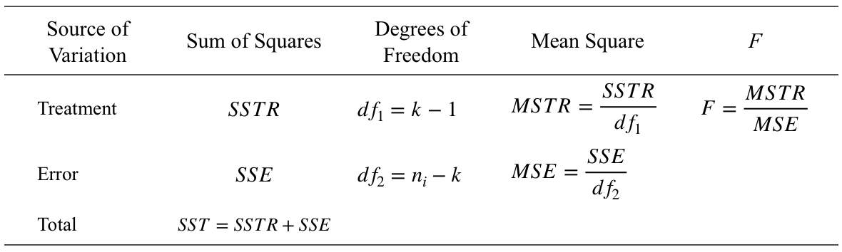
The F-statistic will be large when the between-sample variability is much greater than the within-sample variability, which provides supporting evidence against the null hypothesis. In R we use aov to perform ANOVA. As our results indicate, our F-statistic is 3.202 with , which provides solid evidence that our group means are not all equal.
anova_results <- aov(MonthlyIncome ~ Department, data = attrition)
summary(anova_results)
##               Df    Sum Sq  Mean Sq F value Pr(>F)
## Department     2 1.415e+08 70754962   3.202  0.041 *
## Residuals   1467 3.242e+10 22098613
## ---
## Signif. codes:  0 '***' 0.001 '**' 0.01 '*' 0.05 '.' 0.1 ' ' 1
However, our ANOVA table does not tell us where or what differences exist; it just tells us that there is a difference among our group means. We can use Tukey’s range test to find the means that are significantly different from each other. Tukey’s test is based on a formula very similar to that of the t-test and is represented as
where is the larger of the two means being compared, is the smaller, SE represents the standard error of the sum of the means, and the resulting value can then be compared to a q value from the studentized range distribution with a specified confidence level.
Applying Tukey’s range test with TukeyHSD allows us to see that the primary difference in monthly income rests between the Sales and Research Development Departments where the p-value provides solid evidence that the average monthly Sales department income is $678 more than the average monthly Research Development department income. You can also visualize these differences with plot(TukeyHSD(anova_results)).
TukeyHSD(anova_results)
##   Tukey multiple comparisons of means
##     95% family-wise confidence level
##
## Fit: aov(formula = MonthlyIncome ~ Department, data = attrition)
##
## $Department
##                                           diff         lwr      upr     p adj
## Research_Development-Human_Resources -373.2551 -1807.57002 1061.060 0.8143913
## Sales-Human_Resources                 304.6647 -1179.72420 1789.054 0.8800639
## Sales-Research_Development            677.9198    46.02548 1309.814 0.0320059
Of course, not all variables are numeric. For example, we may wonder if the gender proportion is the same for those employees that churn versus those that do not. Below we can see that the proportions are fairly similar (41% of employees that do not churn are female versus 37% of those that do churn).
# proportions table
attrition %>%
  group_by(Attrition) %>%
  count(Gender) %>%
  mutate(pct = n / sum(n))
## # A tibble: 4 x 4
## # Groups: Attrition [2]
##   Attrition Gender     n   pct
##   <fctr>    <fctr> <int> <dbl>
## 1 No        Female   501 0.406
## 2 No        Male     732 0.594
## 3 Yes       Female    87 0.367
## 4 Yes       Male     150 0.633
Consequently, we would like to test the hypothesis
To test this hypothesis we can use the two-sample Z test statistic to compare the proportions between two categorical groups (attrition vs. non-attrition). The two sample Z-test is represented as
where , and and represents the number of and proportion of records with the given value for sample i, respectively. In our example, represents the proportion of a given gender (i.e. female) where Attrition = Yes and represents the proportion of that same gender where Attrition = No.
We can apply prop.test in R to perform the two-sample Z-test. Note that prop.test will use the first column in the output of table. In our example this is Female so our prop.test is testing for a difference in the proportion of females that churn versus those that do not. Our p-value suggests no evidence to reject the null hypothesis so we can be fairly confident that there are equal proportions of each gender that do and do not churn.
# hypothesis test for proportions
table(attrition$Attrition, attrition$Gender) %>%
  prop.test()
##
## 	2-sample test for equality of proportions with continuity
## 	correction
##
## data:  .
## X-squared = 1.117, df = 1, p-value = 0.2906
## alternative hypothesis: two.sided
## 95 percent confidence interval:
##  -0.03048928  0.10896414
## sample estimates:
##    prop 1    prop 2
## 0.4063260 0.3670886
An extension of the two-sample Z test is if we desire to compare proportions across multinomial data. Multinomial data is when there are three or more categorical groups. For example, our attrition data has a MaritalStatus variable that categorizes employees as single, married, or divorced. We may be interested in understanding if there are differences in the proportions of these categories () for employees that churn versus those that do not.
table(attrition$Attrition, attrition$MaritalStatus) %>%
  addmargins()
##
##       Divorced Married Single  Sum
##   No       294     589    350 1233
##   Yes       33      84    120  237
##   Sum      327     673    470 1470
The hypothesis here is:
To determine if there is sufficient evidence against , we compare the observed frequencies with the expected frequencies if were true. To compute expected frequencies we use
For example, our expected frequency for a divorced employee that did not attrit is
whereas the actual observed frequency was 294. We can compare the difference between the observed frequencies (O) and the expected frequencies (E) with the (chi-square) test statistic
which will be large with a small p-value if the difference between O and E is sufficiently large. We can pass our frequency table to chisq.test in R to compute the -statistic. Our results suggest there is very strong evidence that the marital status proportions are not consistent between employees that churn versus those that do not. We can also extract the expected frequencies and standardized residuals. Large absolute standardized residual values identify the categories that deviate the most from their expected frequencies. In our example, the residuals suggest that we actually observed far more employees that are single and churned () than expected (), providing evidence that .
(test_prop <- table(attrition$Attrition, attrition$MaritalStatus) %>%
  chisq.test()
)
##
## 	Pearson's Chi-squared test
##
## data:  .
## X-squared = 46.164, df = 2, p-value = 9.456e-11

# expected values
test_prop$expected
##
##        Divorced  Married    Single
##   No  274.27959 564.4959 394.22449
##   Yes  52.72041 108.5041  75.77551

# standardized residuals
test_prop$stdres
##
##        Divorced   Married    Single
##   No   3.363095  3.488366 -6.725649
##   Yes -3.363095 -3.488366  6.725649