
![]() Smoothing methods are a family of forecasting methods that average values over multiple periods in order to reduce the noise and uncover patterns in the data. Moving averages are one such smoothing method. Moving averages is a smoothing approach that averages values from a window of consecutive time periods, thereby generating a series of averages. The moving average approaches primarily differ based on the number of values averaged, how the average is computed, and how many times averaging is performed. This tutorial will walk you through the basics of performing moving averages.
Smoothing methods are a family of forecasting methods that average values over multiple periods in order to reduce the noise and uncover patterns in the data. Moving averages are one such smoothing method. Moving averages is a smoothing approach that averages values from a window of consecutive time periods, thereby generating a series of averages. The moving average approaches primarily differ based on the number of values averaged, how the average is computed, and how many times averaging is performed. This tutorial will walk you through the basics of performing moving averages.
There are four R packages outside of the base set of functions that will be used in the tutorial:
library(tidyverse)      # data manipulation and visualization
library(lubridate)      # easily work with dates and times
library(fpp2)           # working with time series data
library(zoo)            # working with time series data
The most straightforward method is called a simple moving average. For this method, we choose a number of nearby points and average them to estimate the trend. When calculating a simple moving average, it is beneficial to use an odd number of points so that the calculation is symmetric. For example, to calculate a 5 point moving average, the formula is:
where t is the time step that you are smoothing at and 5 is the number of points being used to calculate the average (which moving forward will be denoted as k). To compute moving averages on our data we can leverage the rollmean function from the zoo package. Here, we focus on the personal savings rate (psavert) variable in the economics data frame. Using mutate and rollmean, I compute the 13, 25, …, 121 month moving average values and add this data back to the data frame. Note that we need to explicitly state to fill any years that cannot be computed (due to lack of data) with NA.
savings <- economics %>%
  select(date, srate = psavert) %>%
  mutate(srate_ma01 = rollmean(srate, k = 13, fill = NA),
         srate_ma02 = rollmean(srate, k = 25, fill = NA),
         srate_ma03 = rollmean(srate, k = 37, fill = NA),
         srate_ma05 = rollmean(srate, k = 61, fill = NA),
         srate_ma10 = rollmean(srate, k = 121, fill = NA))

savings
## # A tibble: 574 x 7
##          date srate srate_ma01 srate_ma02 srate_ma03 srate_ma05 srate_ma10
##        <date> <dbl>      <dbl>      <dbl>      <dbl>      <dbl>      <dbl>
##  1 1967-07-01  12.5         NA         NA         NA         NA         NA
##  2 1967-08-01  12.5         NA         NA         NA         NA         NA
##  3 1967-09-01  11.7         NA         NA         NA         NA         NA
##  4 1967-10-01  12.5         NA         NA         NA         NA         NA
##  5 1967-11-01  12.5         NA         NA         NA         NA         NA
##  6 1967-12-01  12.1         NA         NA         NA         NA         NA
##  7 1968-01-01  11.7   11.97692         NA         NA         NA         NA
##  8 1968-02-01  12.2   11.81538         NA         NA         NA         NA
##  9 1968-03-01  11.6   11.65385         NA         NA         NA         NA
## 10 1968-04-01  12.2   11.56923         NA         NA         NA         NA
## # ... with 564 more rows
Now we can go ahead and plot these values and compare the actual data to the different moving average smoothers.
savings %>%
  gather(metric, value, srate:srate_ma10) %>%
  ggplot(aes(date, value, color = metric)) +
  geom_line()
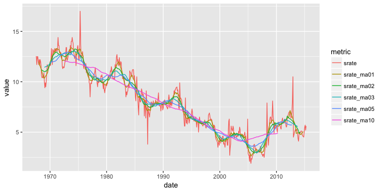
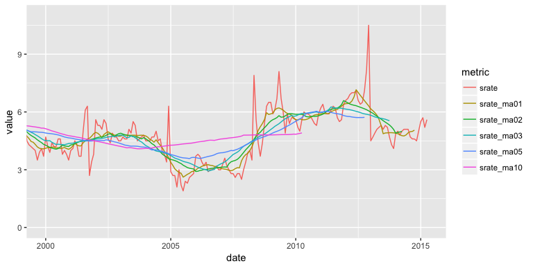
You may notice that as the number of points used for the average increases, the curve becomes smoother and smoother. Choosing a value for k is a balance between eliminating noise while still capturing the data’s true structure. For this set, the 10 year moving average () eliminates most of the pattern and is probably too much smoothing, while a 1 year moving average () offers little more than just looking at the data itself. We can see this by zooming into the 2000-2015 time range:
savings %>%
  gather(metric, value, srate:srate_ma10) %>%
  ggplot(aes(date, value, color = metric)) +
  geom_line() +
  coord_cartesian(xlim = c(date("2000-01-01"), date("2015-04-01")), ylim = c(0, 11))
To understand how these different moving averages compare we can compute the MSE and MAPE. Both of these error rates will increase as you choose a larger k to average over; however, if you or your leadership are indifferent between a 6-9% error rate then you may want to illustrate trends with a 3 year moving average rather than a 1 year moving average.
savings %>%
  gather(metric, value, srate_ma01:srate_ma10) %>%
  group_by(metric) %>%
  summarise(MSE = mean((srate - value)^2, na.rm = TRUE),
            MAPE = mean(abs((srate - value)/srate), na.rm = TRUE))
## # A tibble: 5 x 3
##       metric       MSE       MAPE
##        <chr>     <dbl>      <dbl>
## 1 srate_ma01 0.3906915 0.06418596
## 2 srate_ma02 0.5635048 0.08220497
## 3 srate_ma03 0.7240555 0.09562386
## 4 srate_ma05 0.8316605 0.10897992
## 5 srate_ma10 1.3188706 0.15199296
A simple moving average can also be plotted by using autoplot() contained in the fpp2 package. This is helpful if your data is already in time series data object. For example, if our savings rate data were already converted to a time series object as here…
savings.ts <- economics %>%
  select(srate = psavert) %>%
  ts(start = c(1967, 7), frequency = 12)

head(savings.ts, 30)
##       Jan  Feb  Mar  Apr  May  Jun  Jul  Aug  Sep  Oct  Nov  Dec
## 1967                               12.5 12.5 11.7 12.5 12.5 12.1
## 1968 11.7 12.2 11.6 12.2 12.0 11.6 10.6 10.4 10.4 10.6 10.4 10.9
## 1969 10.0  9.4  9.9  9.5 10.0 10.9 11.7 11.5 11.5 11.3 11.5 11.7
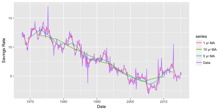
…we can plot this data with autoplot. Here, the data is plotted in line 1 of the following code, while the moving average (calculated using the ma() function) is plotted in the second layer.
autoplot(savings.ts, series = "Data") +
  autolayer(ma(savings.ts, 13), series = "1 yr MA") +
  autolayer(ma(savings.ts, 61), series = "5 yr MA") +
  autolayer(ma(savings.ts, 121), series = "10 yr MA") +
  xlab("Date") +
  ylab("Savings Rate")
Centered moving averages are computed by averaging across data both in the past and future of a given time point. In that sense they cannot be used for forecasting because at the time of forecasting, the future is typically unknown. Hence, for purposes of forecasting, we use trailing moving averages, where the window of k periods is placed over the most recent available k values of the series. For example, if we have data up to time period t, we can predict the value for t+1 by averaging over k periods prior to t+1. If we want to use the 5 most recent time periods to predict for t+1 then our function looks like:
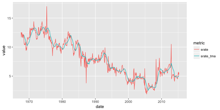
So, if we wanted to predict the next month’s savings rate based on the previous year’s average, we can use rollmean with the align = "right" argument to compute a trailing moving average. We can see that if we wanted to predict what the savings rate would be for 2015-05-01 based on the the last 12 months, our prediction would be 5.06% (the 12-month average for 2015-04-01). This is now similar to using a naive forecast but with an averaged value rather than the last actual value.
savings_tma <- economics %>%
  select(date, srate = psavert) %>%
  mutate(srate_tma = rollmean(srate, k = 12, fill = NA, align = "right"))

tail(savings_tma, 12)
## # A tibble: 12 x 3
##          date srate srate_tma
##        <date> <dbl>     <dbl>
##  1 2014-05-01   5.1  4.900000
##  2 2014-06-01   5.1  4.883333
##  3 2014-07-01   5.1  4.883333
##  4 2014-08-01   4.7  4.833333
##  5 2014-09-01   4.6  4.783333
##  6 2014-10-01   4.6  4.775000
##  7 2014-11-01   4.5  4.791667
##  8 2014-12-01   5.0  4.866667
##  9 2015-01-01   5.5  4.916667
## 10 2015-02-01   5.7  4.975000
## 11 2015-03-01   5.2  5.008333
## 12 2015-04-01   5.6  5.058333
We can visualize how the 12-month trailing moving average predicts future savings rates with the following plot. It’s easy to see that trailing moving averages have a delayed reaction to changes in patterns and trends.
savings_tma %>%
  gather(metric, value, -date) %>%
  ggplot(aes(date, value, color = metric)) +
  geom_line()
The concept of simple moving averages can be extended to taking moving averages of moving averages. This technique is often employed with an even number of data points so that the final product is symmetric around each point. For example, let’s look at the built-in data set elecsales provided by the fpp2 package. For our first example we convert to a data frame. This data frame is even numbered with 20 rows.
# convert to data frame
elecsales.df <- data.frame(year = time(elecsales), sales = elecsales)

nrow(elecsales.df)
## [1] 20
An even-numbered moving average is unbalanced, and for our purposes, the unbalancing will be in favor of more recent observations. For example, to calculate a 4-MA, the equation is as follows:
To make the moving average symmetric (and therefore more accurate), we then take a 2-MA of the 4-MA to create a 2 x 4-MA. For the 2-MA step, we average the current and previous moving averages, thus resulting in an overall estimate of:
This two-step process can be performed easily with the ma function by setting order = 4 and centre = TRUE.
elecsales.df %>%
  mutate(ma4 = ma(sales, order = 4, centre = TRUE)) %>%
  head()
##   year   sales      ma4
## 1 1989 2354.34       NA
## 2 1990 2379.71       NA
## 3 1991 2318.52 2384.359
## 4 1992 2468.99 2412.047
## 5 1993 2386.09 2467.918
## 6 1994 2569.47 2536.784
To compare this moving average to a regular moving average we can plot the two outputs:
# compute 2 and 2x4 moving averages
elecsales.df %>%
  mutate(ma2 = rollmean(sales, k = 2, fill = NA),
         ma2x4 = ma(sales, order = 4, centre = TRUE)) %>%
  gather(ma, value, ma2:ma2x4) %>%
  ggplot(aes(x = year)) +
  geom_point(aes(y = sales)) +
  geom_line(aes(y = value, color = ma))
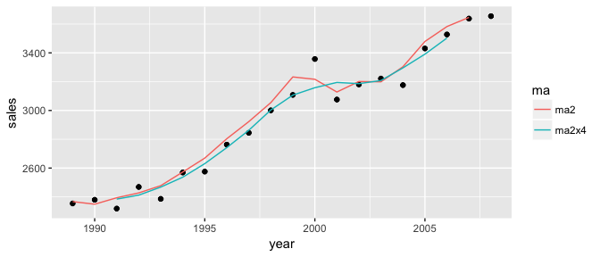
This 2 x 4-MA process produces the best fit yet. It massages out some of the noise while maintaining the overall trend of the data. Other combinations of moving averages are possible, such as 3 x 3-MA. To maintain symmetry, if your first moving average is an even number of points, the follow-up MA should also contain an even number. Likewise, if your first MA uses an odd number of points, the follow-up should use an odd number of points. Just keep in mind that moving averages of moving averages will lose information as you do not retain as many data points.
If your data is already in a time series data object, then you can apply the ma function directly to that object with order = 4 and centre = TRUE. For example, the built-in elecsales data set is a time series object:
class(elecsales)
## [1] "ts"
We can compute the 2x4 moving average directly:
ma(elecsales, order = 4, centre = TRUE)
## Time Series:
## Start = 1989
## End = 2008
## Frequency = 1
##  [1]       NA       NA 2384.359 2412.047 2467.918 2536.784 2630.801
##  [8] 2742.006 2862.457 3003.352 3106.600 3157.988 3194.662 3186.188
## [15] 3207.888 3295.610 3391.006 3502.892       NA       NA
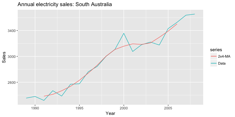
And we can use autoplot to plot the the 2x4 moving average against the raw data:
autoplot(elecsales, series = "Data") +
  autolayer(ma(elecsales, order = 4, centre = TRUE), series = "2x4-MA") +
  labs(x = "Year", y = "Sales") +
  ggtitle("Annual electricity sales: South Australia")
A moving average of a moving average can be thought of as a symmetric MA that has different weights on each nearby observation. For example, the 2x4-MA discussed above is equivalent to a weighted 5-MA with weights given by . In general, a weighted m-MA can be written as
where and the weights are given by . It is important that the weights all sum to one and that they are symmetric so that . This simple m-MA is a special case where all the weights are equal to . A major advantage of weighted moving averages is that they yield a smoother estimate of the trend-cycle. Instead of observations entering and leaving the calculation at full weight, their weights are slowly increased and then slowly decreased resulting in a smoother curve. Some specific sets of weights are widely used such as the following:
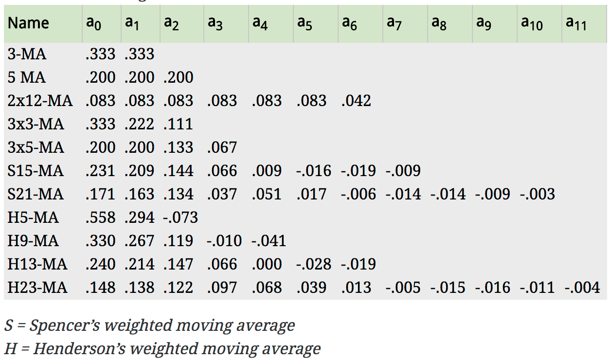
Fig: Commonly used weights in weighted moving averages (Hyndman & Athanasopoulos, 2014)
For example, the AirPassengers data contains an entry for every month in a 12 year span, so a time period would consist of 12 time units. A 2 x 12-MA set-up is the preferred method for such data. The observation itself, as well as the 5 observations immediately before and after it, receives weight , while the data point for that month last year and that month the following year both receive weight .
We can produce this weighted moving average using the ma function as we did in the last section
ma(AirPassengers, order = 12, centre = TRUE)
##           Jan      Feb      Mar      Apr      May      Jun      Jul
## 1949       NA       NA       NA       NA       NA       NA 126.7917
## 1950 131.2500 133.0833 134.9167 136.4167 137.4167 138.7500 140.9167
## 1951 157.1250 159.5417 161.8333 164.1250 166.6667 169.0833 171.2500
## 1952 183.1250 186.2083 189.0417 191.2917 193.5833 195.8333 198.0417
## 1953 215.8333 218.5000 220.9167 222.9167 224.0833 224.7083 225.3333
## 1954 228.0000 230.4583 232.2500 233.9167 235.6250 237.7500 240.5000
## 1955 261.8333 266.6667 271.1250 275.2083 278.5000 281.9583 285.7500
## 1956 309.9583 314.4167 318.6250 321.7500 324.5000 327.0833 329.5417
## 1957 348.2500 353.0000 357.6250 361.3750 364.5000 367.1667 369.4583
## 1958 375.2500 377.9167 379.5000 380.0000 380.7083 380.9583 381.8333
## 1959 402.5417 407.1667 411.8750 416.3333 420.5000 425.5000 430.7083
## 1960 456.3333 461.3750 465.2083 469.3333 472.7500 475.0417       NA
##           Aug      Sep      Oct      Nov      Dec
## 1949 127.2500 127.9583 128.5833 129.0000 129.7500
## 1950 143.1667 145.7083 148.4167 151.5417 154.7083
## 1951 173.5833 175.4583 176.8333 178.0417 180.1667
## 1952 199.7500 202.2083 206.2500 210.4167 213.3750
## 1953 225.3333 224.9583 224.5833 224.4583 225.5417
## 1954 243.9583 247.1667 250.2500 253.5000 257.1250
## 1955 289.3333 293.2500 297.1667 301.0000 305.4583
## 1956 331.8333 334.4583 337.5417 340.5417 344.0833
## 1957 371.2083 372.1667 372.4167 372.7500 373.6250
## 1958 383.6667 386.5000 390.3333 394.7083 398.6250
## 1959 435.1250 437.7083 440.9583 445.8333 450.6250
## 1960       NA       NA       NA       NA       NA
And to compare this moving average to the actual time series:
autoplot(AirPassengers, series = "Data") +
  autolayer(ma(AirPassengers, order = 12, centre = T), series = "2x12-MA") +
  ggtitle("Monthly Airline Passengers (1949-60)") +
  labs(x = NULL, y = "Passengers")
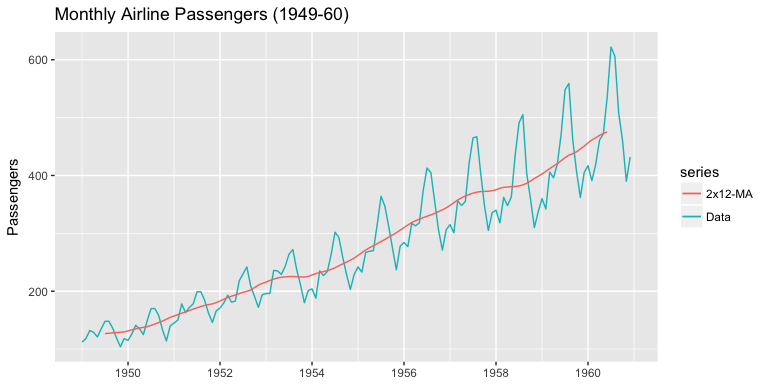
You can see we’ve smoothed out the seasonality but have captured the overall trend.
Using the economics data set provided by the ggplot2 package: